

A San Antonio gym or fitness studio website needs to do more than list class times. It should let a prospect book a class, sign a waiver, and claim a free trial offer in a few taps, because most local gym searches happen on a phone and decisions happen fast. Member photos and class-schedule integration turn a browser into a booked visitor.
A gym website is not a brochure. It is the front desk for every person who searches “gyms near me” before they ever walk through your door, and it either makes booking a class simple or sends that prospect to a competitor’s site instead.
Most fitness studio websites still function like a digital flyer: hours, a phone number, and a class list that has not been updated in months. That approach quietly loses the exact leads a modern gym website should be capturing, because a prospect comparing three or four studios rarely calls the one that makes them work the hardest to find a class.
At Texas Web Design, we build fitness studio and gym websites around class booking, membership sign-up, and social proof, the features that actually convert San Antonio searchers into members. Contact us today to map out what your gym’s website needs first.
Why a Standard Website Falls Short for Gyms and Studios
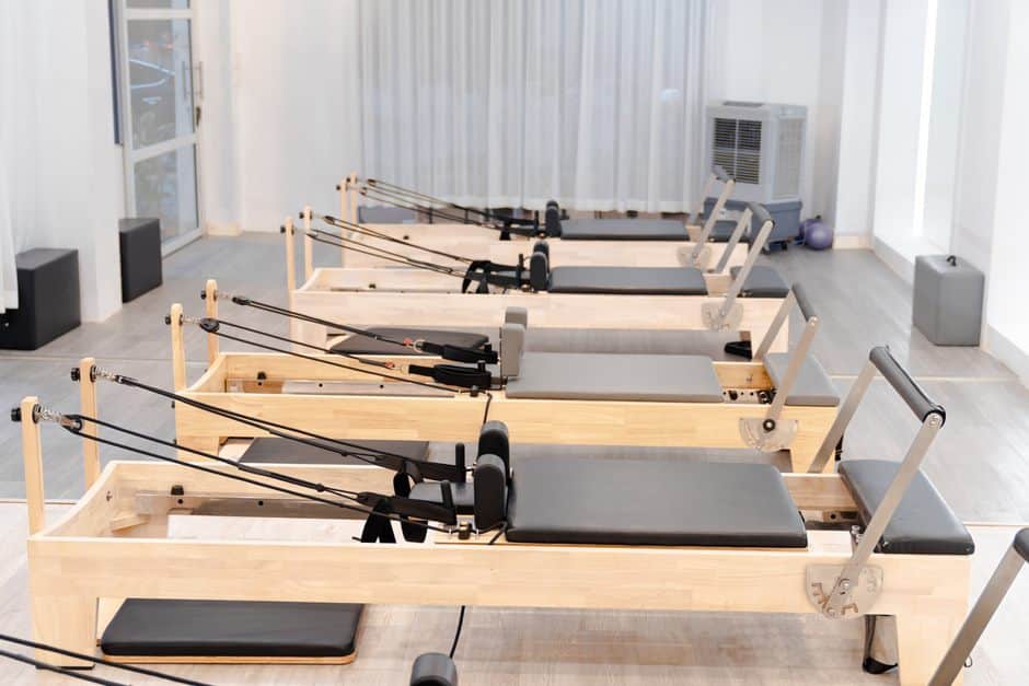
US fitness facility membership reached a record 77 million people in 2024, according to the Health & Fitness Association, roughly a quarter of the population age six and older. That much demand means San Antonio gyms are competing for attention in a crowded local search results page. Your site’s build plays into that, as covered in how web design affects local search visibility.
The studios winning that competition are not the ones with the prettiest photos. They are the ones whose websites remove friction between a search and a booked class, which is where a handful of specific features matter more than general design polish. The table below lays out the priorities, and each section afterward walks through why it matters and how to build it well.
San Antonio’s fitness market includes everything from single-location yoga studios to multi-location gym chains, and most of them compete for the same pool of nearby searchers. A generic template website makes it harder to stand out in that mix, since near-identical layouts and stock photography can make several competing studios look interchangeable on the same results page. If you are comparing builders, see how San Antonio businesses choose a web partner.
| Website Feature | Why It Matters for Fitness Businesses |
|---|---|
| Real-time class booking | Lets a prospect reserve a spot the moment they decide, without a phone call |
| Digital waivers and sign-up forms | Removes a front-desk bottleneck and speeds up new-member onboarding |
| Free trial or intro-offer landing page | Gives a low-commitment next step for a “gyms near me” searcher |
| Member stories and class photos | Builds trust fast for someone who has never set foot in the studio |
| Mobile-first speed | Matches how most gym searches happen, on a phone, between other tasks |
The rest of this guide walks through those priorities in order, starting with the one that shapes every other decision on the site: how someone actually books a class.
Step One: Put Class Schedules and Real-Time Booking Front and Center
A class schedule buried three clicks deep, or worse, only available as a PDF, asks too much of a prospect who is comparing several studios at once. The schedule and the booking button belong near the top of the homepage, not tucked into a separate page.
Real-time booking, where a class fills and updates live instead of relying on a phone call or a walk-in, matches how people already expect to reserve anything else, from a restaurant table to a haircut. Mindbody’s 2025 State of the Industry Report found that fitness and wellness operators investing in technology are far more confident about growth than those holding back, with tech-forward businesses 1.6 times more likely to describe themselves as “very optimistic” about performance. Showing open spots in real time also cuts down on the back-and-forth of a prospect calling to ask whether a class is full.
That data lines up with mobile search behavior generally. Roughly 76 percent of people who run a “near me” search on a smartphone visit that business within a day, which means a slow or confusing booking flow can cost a sign-up that was already close to happening.
Step Two: Streamline Membership Sign-Ups and Digital Waivers
Once someone decides to try a class, the sign-up process is the next place a gym website can lose them. A membership form that requires printing, scanning, or a trip to the front desk before someone’s first visit adds friction at exactly the wrong moment.
Digital waivers and online membership forms solve this by letting a new member handle paperwork from their phone before they arrive. That shifts the front desk’s job from processing forms to welcoming people, and it shortens the gap between interest and a first workout. It also gives the studio a clean digital record of every signed waiver, which is easier to search than a filing cabinet full of paper.
The sign-up flow should also be short. Asking only for what is truly needed at that stage, with account details and full billing setup handled after the first visit if your studio prefers it, keeps the initial commitment low enough that hesitant prospects still follow through.
A digital sign-up flow also gives owners a clearer picture of where prospects drop off, since an abandoned form points to a specific fix. Staff also spend less time chasing paperwork, since a digital record stays complete and searchable.
Step Three: Build Free Trial and Intro-Offer Landing Pages That Convert
A free class, a discounted first week, or a no-commitment trial pass is often the easiest way to get a hesitant prospect through the door. That offer deserves its own page, not a buried mention on the homepage.
A focused trial-offer landing page strips away distractions and gives one clear next step: claim the offer and pick a time. Fewer competing links on that page means fewer people who click away before finishing, since a page trying to sell memberships, merchandise, and the trial all at once tends to convert none of them well.
The offer page should also set expectations plainly, covering what the trial includes, whether a waiver is required first, and what happens after the trial ends. Prospects who know what to expect are more likely to show up for that first class instead of quietly letting the offer expire.
Step Four: Use Member Stories and Class Photos as Social Proof
A prospect who has never visited your studio is deciding based on trust signals alone, and generic stock photography does not build that trust. Real class photos, real instructor faces, and real member transformation stories carry far more weight because they show what actually happens inside your walls.
A short gallery of before-and-after stories, paired with a few sentences in the member’s own words, does more convincing than a paragraph of marketing copy. It answers the unspoken question every new prospect has: will this actually work for someone like me? Rotating in new photos from recent classes also signals that the studio is active right now, not just when the site was first built.
This content also has a second life beyond the website. Studios that keep an active social media marketing presence can pull the same class photos and member stories into posts, which reinforces the same trust signals everywhere a prospect might encounter the brand.
Step Five: Design for Mobile Speed and Simple Booking Friction
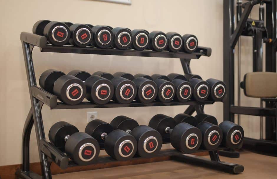
Every feature above works only if the site loads fast and works cleanly on a phone, since that is where most “gyms near me” searches happen. A slow page or a hard-to-tap booking button undoes the value of everything else on the site.
Responsive, mobile-first design means the schedule, the trial offer, and the sign-up form all resize and load cleanly on a phone screen, with buttons large enough to tap without zooming in first.
Speed matters as much as layout. A booking flow that takes ten seconds to load a page, or a schedule that requires pinching and zooming to read, gives a prospect an easy reason to close the tab and try the next gym in their search results instead. Slow pages are among the common website design mistakes businesses still make.
Image weight is one of the most common culprits behind a slow-loading gym website, since high-resolution class photos and video backgrounds can bloat load time if they are not compressed properly. Small choices matter too, like keeping the booking button visible without scrolling and skipping pop-ups that block the schedule the moment a page loads.
Build a San Antonio Fitness Website That Fills Classes and Keeps Members
The gyms and studios that grow are the ones whose websites turn a passing search into a booked class with as few steps as possible. Class schedules, digital waivers, trial pages, and member stories are not extra features; they are the core job of a fitness website. These tips on choosing the right web design agency can help you find a team to build them.
At Texas Web Design, we build gym and studio websites around exactly those priorities for businesses across San Antonio. Call us today at 210-985-8528 to talk through what your fitness website needs first.
Frequently Asked Questions
How much does a gym website cost in San Antonio?
Cost depends on the features involved, since a site with real-time booking, digital waivers, and a trial landing page takes more development time than a simple brochure site. A clear quote requires knowing which of those features your studio actually needs.
What features does a fitness studio website need?
At minimum, a fitness website needs an up-to-date class schedule, a booking option, a trial or intro-offer page, and real photos or stories from current members. Digital waivers and mobile-first design round out the priorities that matter most.
Should my gym website have online class booking?
Yes, since most prospects expect to reserve a spot without calling the front desk. Real-time booking also reduces no-shows because members can see availability and reschedule easily.
Do I need a separate landing page for a free trial offer?
A dedicated page performs better than a homepage mention because it removes distractions and focuses on one action: claiming the trial. It also lets you track how well the offer is converting separately from general site traffic.
How important is mobile design for a gym website?
It is one of the most important factors, since most local gym searches happen on a phone. A site that loads slowly or is hard to tap on a small screen loses prospects before they ever see a class schedule.
Can a website collect digital waivers before someone visits?
Yes, digital waiver and sign-up forms let a new member complete paperwork from their phone ahead of their first visit. That shortens the front-desk process and lets staff focus on welcoming people instead of processing forms.
Do member testimonials actually help convert new sign-ups?
Real member stories and class photos build trust faster than generic stock imagery, since prospects are looking for proof that people like them succeed at your studio. A short gallery of transformations paired with a few authentic quotes tends to outperform polished marketing copy.
How long does it take to build a gym or studio website?
Timelines vary with the features involved, but a site with class booking, waivers, and a trial landing page generally takes longer than a basic informational site. The clearest way to get a realistic timeline is to talk through your specific feature list first.
