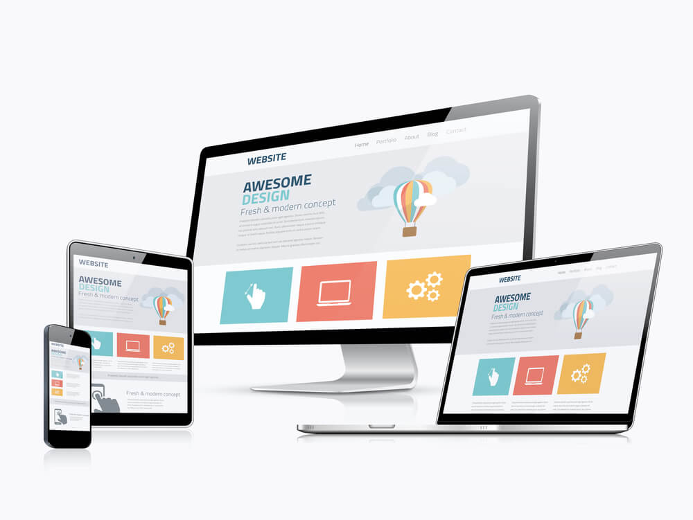
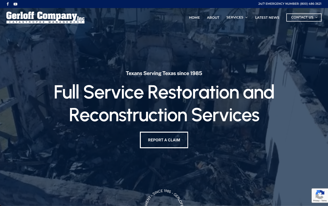
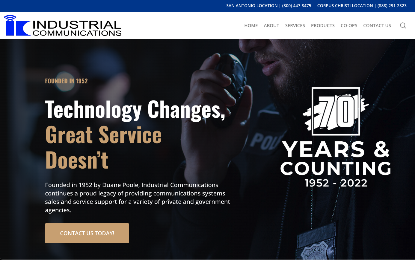
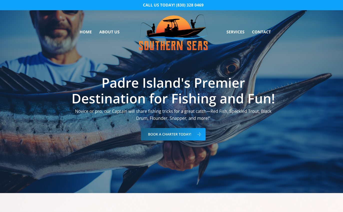
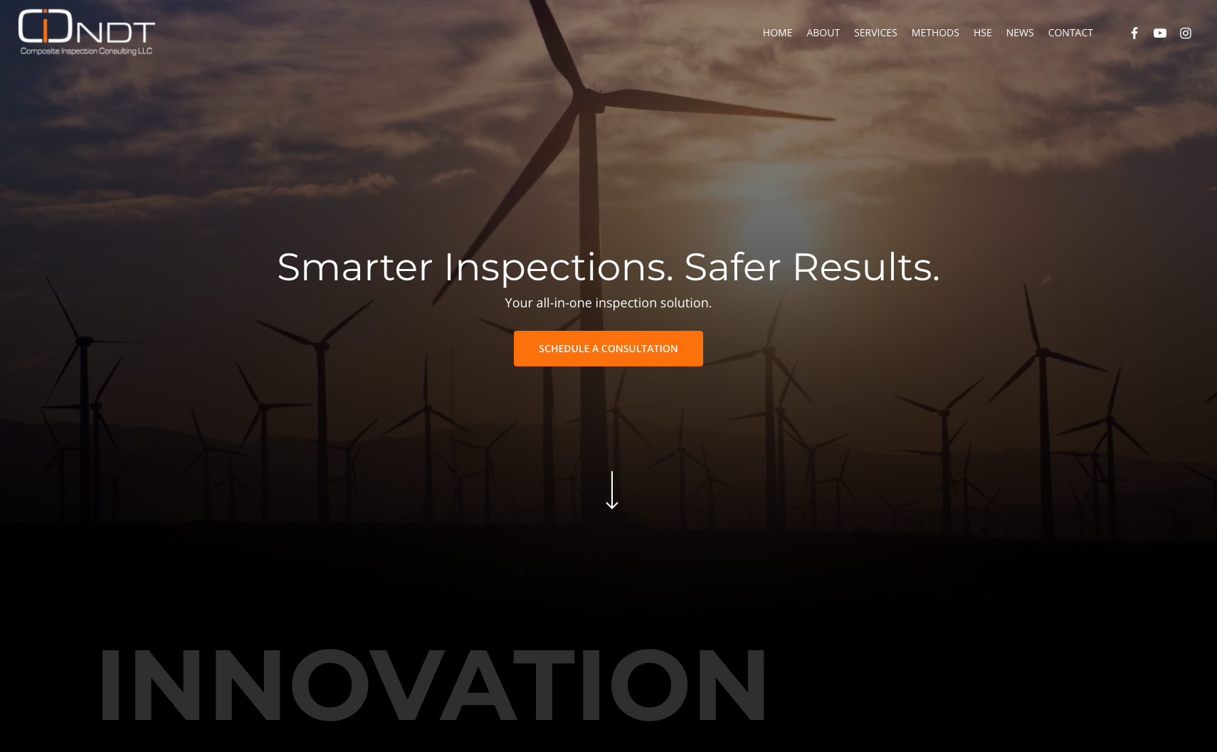
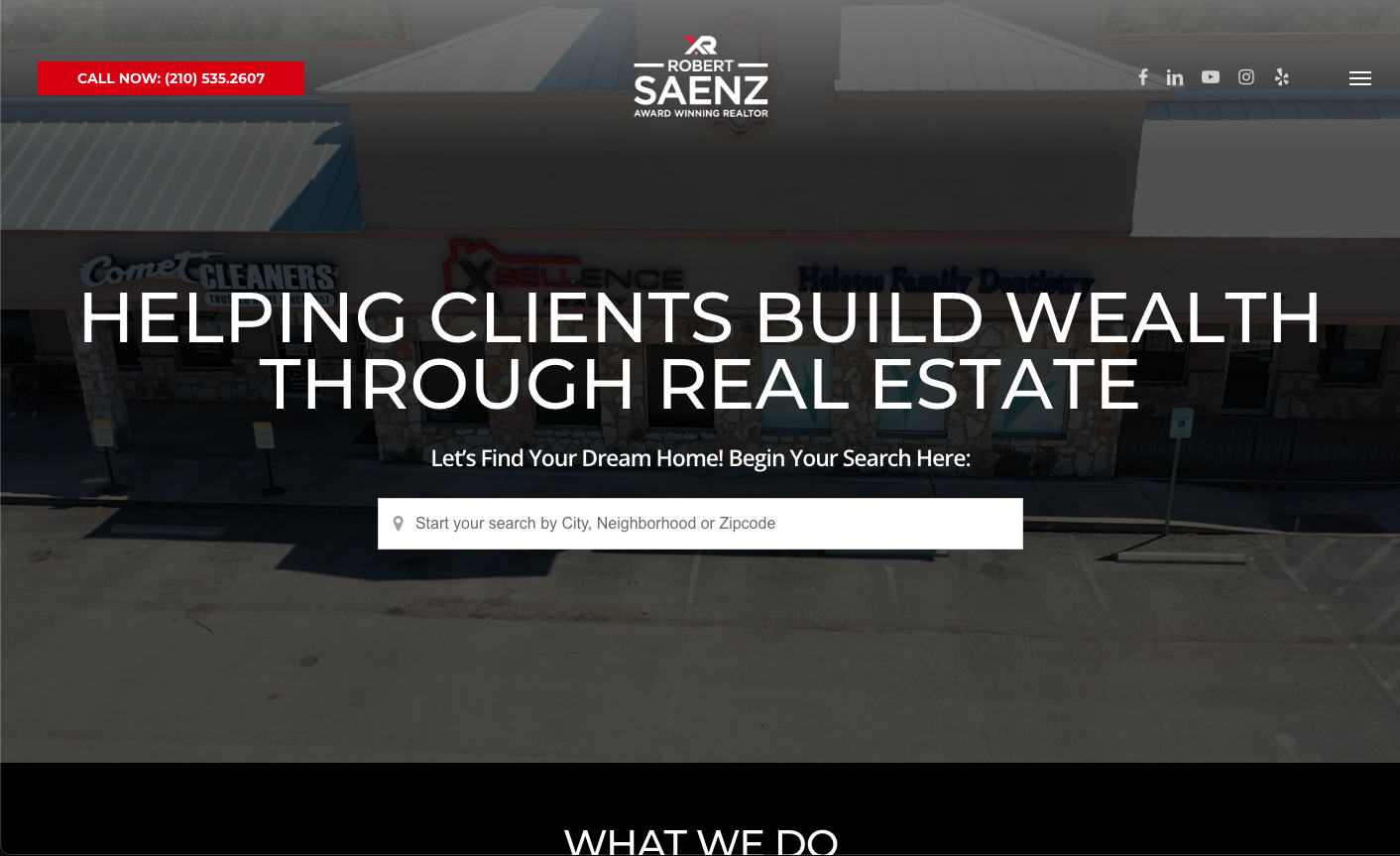
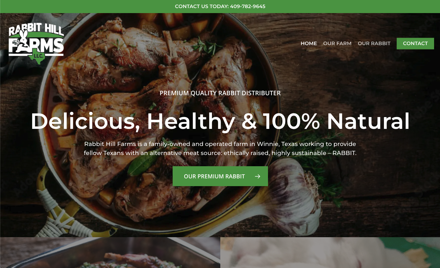
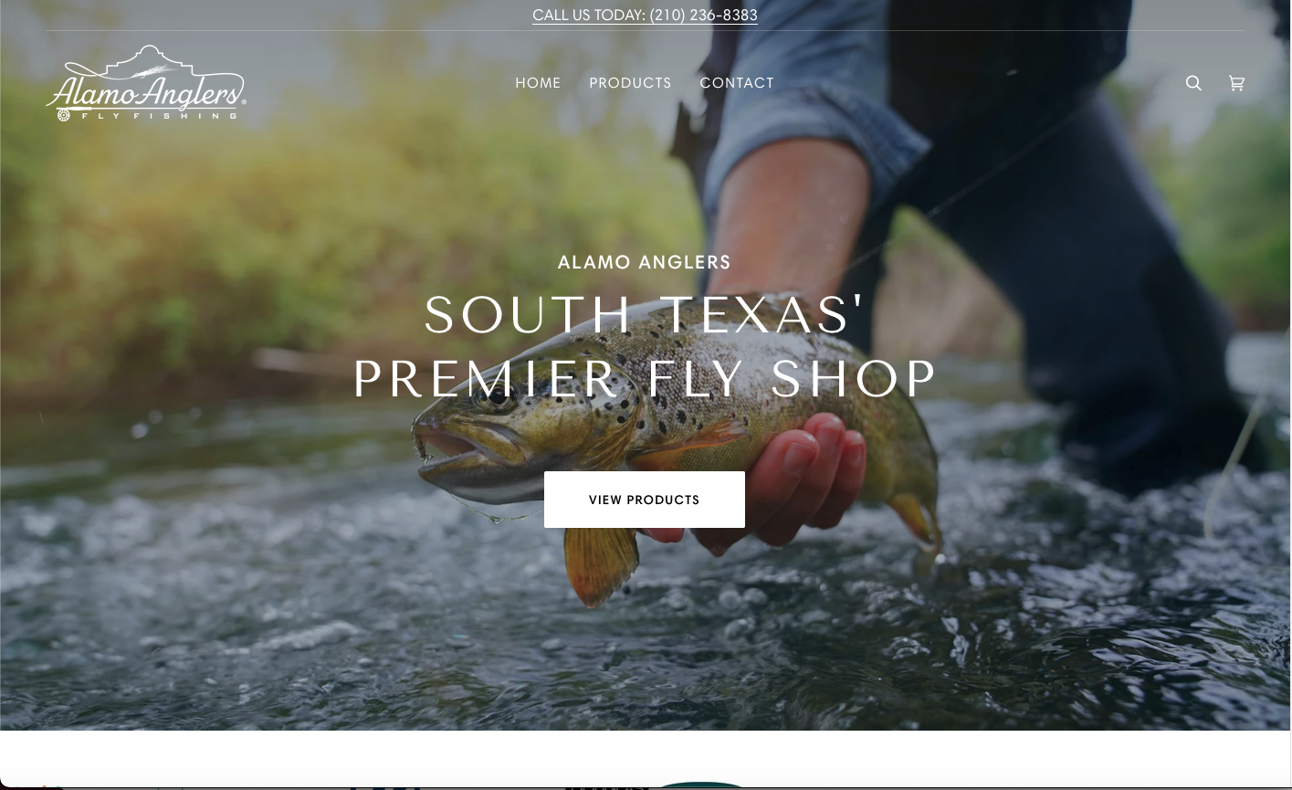
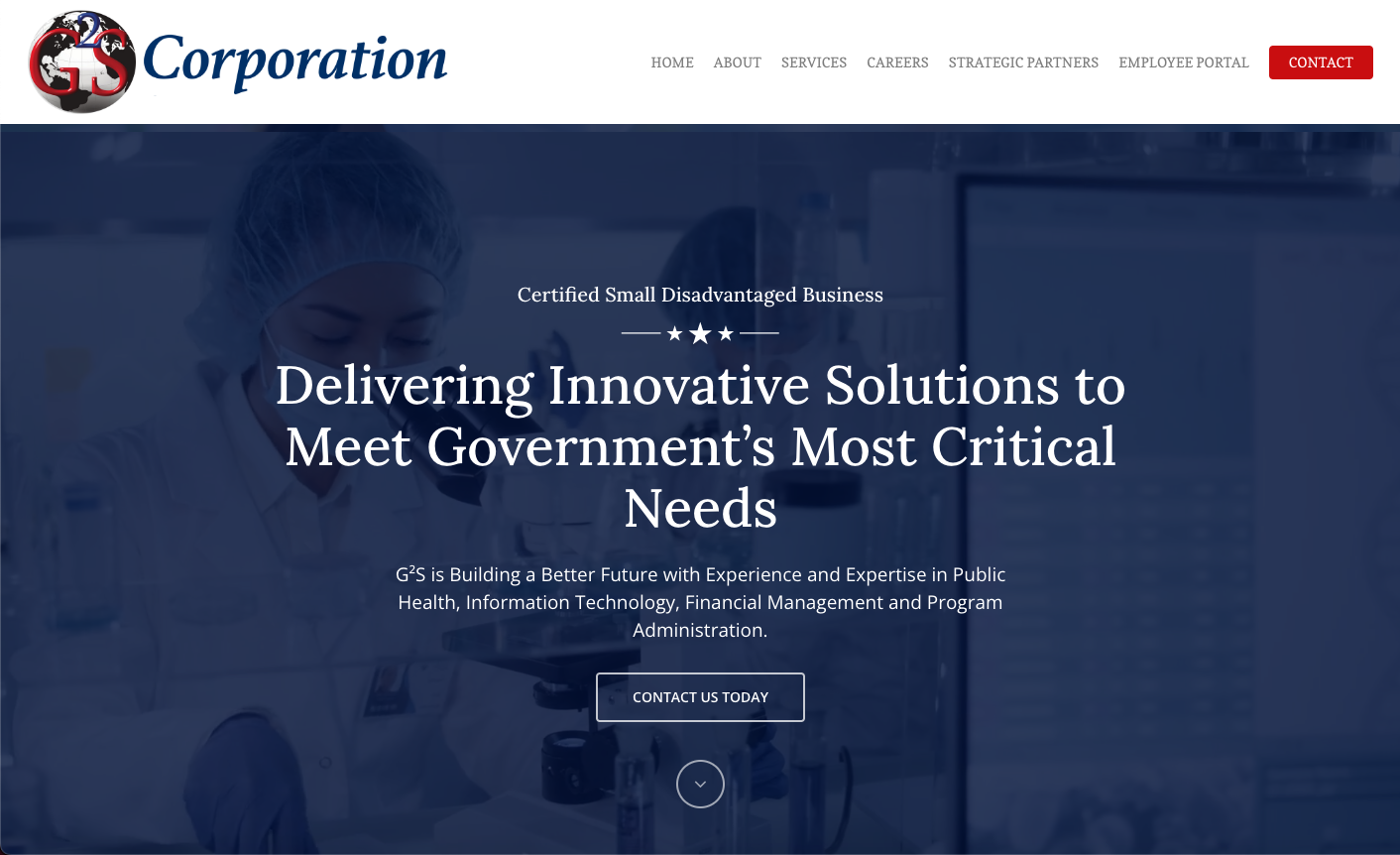
Responsive Web Design: Building Websites for Every Device
Around 60% of your visitors are browsing on their phones. If your site is hard to use on mobile, they leave for a competitor.
At Texas Web Design, we build responsive websites that adapt to any screen size. Your site looks sharp, loads fast, and converts on every device. Contact us today.
Get In Touch
What Is Responsive Web Design?
Responsive web design is an approach that makes your website automatically adjust its layout, images, and content to fit any screen size, from smartphones to desktop monitors, without needing separate mobile and desktop versions.
Instead of building multiple websites, responsive design uses flexible grids and CSS media queries to create one site that works everywhere. Google now uses mobile-first indexing, meaning it looks at your mobile site first when determining rankings.
With roughly 60% of web traffic coming from mobile devices, responsive web design in San Antonio is essential for any business that wants to be found online.
Why Responsive Web Design Matters for Your San Antonio Business
Responsive design in San Antonio is not just about making your website look good on a phone. It directly affects whether people find you, trust you, and choose to do business with you.
Google Prioritizes Mobile-Friendly Websites
Google now uses mobile-first indexing, which means it looks at the mobile version of your site first when deciding where to rank you in search results. If your site is not optimized for mobile, you are at a disadvantage against competitors who have made the investment. A responsive website helps you show up when San Antonio customers search for your services.
Visitors Stay Longer and Convert More Often
When someone lands on a site that is difficult to use on their device, they leave. Research shows that 53% of mobile users will abandon a site that takes longer than three seconds to load. A responsive site keeps visitors engaged by giving them a smooth experience from the moment they arrive. That means more time on your site, more pages viewed, and more leads turning into customers.
One Website to Manage Instead of Two
In the past, businesses sometimes built separate websites for desktop and mobile users. That approach doubles your workload and creates inconsistencies. With responsive design, you have a single website that adapts to every screen. Updates happen once and apply everywhere, saving you time and money on ongoing maintenance.
What You Get With Our Responsive Web Design Services
When you work with Texas Web Design on a responsive website, you are not just getting a site that shrinks to fit smaller screens. You are getting a website engineered from the ground up to perform on every device.
Mobile-First Development: We design for smartphones first, then scale up for tablets and desktops. This approach ensures your mobile visitors get the best possible experience, not an afterthought.
Fast Load Times: We optimize images, streamline code, and build lightweight pages that load quickly on any connection. Speed matters for both user experience and search rankings.
Touch-Friendly Navigation: Buttons and menus are sized for fingers, not mouse pointers. Your visitors can tap, scroll, and navigate without frustration.
Readable Content at Every Size: Text adjusts fluidly so your message is always easy to read. No one should have to zoom in to see your phone number or service descriptions.
Consistent Branding Across Devices: Your logo, colors, and visual identity stay intact whether someone visits from a laptop or an iPhone. Every interaction reinforces your brand.
Built on WordPress: We use WordPress for most projects, giving you a platform that is easy to update and widely supported. You stay in control of your content without needing a developer for every small change.
Our Responsive Web Design Process
We follow a clear process so you always know what to expect. No guesswork, no surprises.
Discovery: We start by learning about your business, your customers, and your goals. What problems are you trying to solve? What actions do you want visitors to take? This conversation shapes everything that follows.
Design: You see mockups of your new site before we write any code. We show you how the design looks on mobile, tablet, and desktop so you can give feedback early when changes are easy to make.
Development: Our team builds your site with clean, efficient code optimized for performance. We handle the technical details so your site loads fast and works reliably.
Testing: We test on real devices, not just browser simulations. iPhones, Android phones, tablets, and various desktop browsers all get checked to make sure everything works as expected.
Launch and Support: Once everything is approved, we launch your site and make sure the transition is smooth. We also offer ongoing maintenance plans so your site stays secure, updated, and running well long after launch.
Why San Antonio Businesses Choose Texas Web Design
You have options when it comes to web design. Here is why local businesses trust us with their online presence.
Local Team, Local Understanding: We are based in San Antonio and work with businesses across Texas. We understand the local market and what your customers expect.
Responsive Design on Every Project: Mobile optimization is not an add-on or upgrade. Every website we build is fully responsive from day one.
Transparent Communication: You will always know where your project stands. We keep you informed at every stage and welcome your questions.
Results That Matter: A beautiful website means nothing if it does not help your business. We focus on building sites that generate leads, support your sales process, and make a real impact on your bottom line.
Ongoing Support Available: We do not disappear after launch. Monthly maintenance plans keep your site secure, backed up, and performing at its best.
Ready for a Website That Works on Every Screen?
Your customers are searching on their phones, tablets, and computers. Make sure your website meets them wherever they are. Call Texas Web Design today at 210-985-8528 for your free consultation and see how a responsive website can help your San Antonio business grow.
Responsive web design is an approach to building websites that automatically adjust their layout and content to fit any screen size. Instead of creating separate sites for mobile and desktop, a responsive site uses flexible grids and CSS media queries to deliver an optimal viewing experience on smartphones, tablets, laptops, and desktop computers.
Responsive design directly improves your search engine rankings. Google uses mobile-first indexing, meaning it evaluates the mobile version of your site first when determining where to rank you. A responsive, mobile-friendly website loads faster, reduces bounce rates, and provides better user experience signals. All of these factors help you rank higher in search results.
Most responsive web design projects range from $2,500 to $15,000 depending on the size of the site, the features you need, and the complexity of the design. We provide a clear quote after a short discovery call so you know exactly what to expect with no hidden fees.
Most projects take four to eight weeks from kickoff to launch. The timeline depends on the scope of the project and how quickly you can provide feedback during the design phase. We will give you a realistic schedule during our initial conversation.
TESTIMONIALS
“
Love their attention to detail, very quick to respond to my marketing edits that were needed ..Would highly recommend for all your marketing needs!
Crystal M.
“
These guys are awesome!!! The best customer service and the best SEO Company in the San Antonio, Tx area!!
Jason Rozacky
“
Not only do their services work, but they are also a pleasure to work with. They are super responsive and go above and beyond to exceed expectations. Highly recommend!
Joshua P
“
Their service goes above and beyond and definitely exceeds expectations. They are professionals and I look forward to many long successful years with them as their client.
Walter Wilson
Our mission is to provide attainable marketing solutions and deliver the finest customer experience with proven results.