Best Responsive WordPress Themes for Your San Antonio Business Website
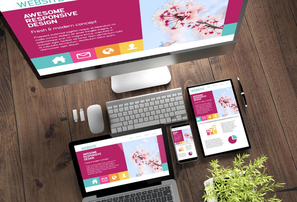
Responsive design isn’t optional anymore; it’s the standard. With more people browsing on mobile than ever, your website needs to look great and work perfectly on every device. That’s where responsive WordPress themes come in.
At Texas Web Design, we help San Antonio businesses choose and customize the best responsive WordPress themes so their websites load fast, stay functional, and deliver an excellent user experience. Whether you’re building a new site or upgrading an old one, these themes give your business the polished, mobile-friendly presence it needs to compete.
Get In Touch
Looking for the best responsive WordPress themes? Here’s what you need to know. Responsive themes automatically adjust to any screen size—mobile, tablet, or desktop—so your website loads fast, looks clean, and works smoothly for every user. Below, we cover the top responsive WordPress themes, key features to look for, and how Texas Web Design helps San Antonio businesses build mobile-ready websites that attract more traffic and conversions.
WordPress is a popular choice for building websites due to its versatility and user-friendly interface. Additionally, there are many responsive WordPress themes that assist businesses in creating functional and visually appealing websites.
Explore high-quality responsive WordPress themes for your website. We’ve selected these themes for their practicality, design, and user-friendliness. Whether it’s a site for a small business or a large corporation, these themes guarantee your website looks fantastic on all devices.
Key Features of Responsive WordPress Themes
Picking a WordPress theme for your website? Make sure it’s responsive by checking some key features.
Choose a theme that works well on mobile, plays nice with different devices, and delivers on speed and performance. And don’t forget customization options; they’re important for tailoring the theme to your website’s specific needs.
Mobile-Friendly Design
Nowadays, it is important to have a mobile-friendly web design. It’s where the majority of internet users access websites on their mobile devices.
Responsive WordPress themes tweak how your website looks to fit the screen size of your device, making the user experience smooth. This makes sure your site looks great on any device—whether it’s a smartphone, tablet, or desktop.
Cross-Device Compatibility
Cross-device compatibility is another key feature of responsive WordPress themes. This means the theme is made to work smoothly on various devices, like smartphones, tablets, and desktops.
When a theme works on different devices, visitors can check out your website from any gadget, and the site will look and work the same way on all of them.
Performance and Speed
Performance and speed are key factors that determine the success of a website. A responsive WordPress theme should be optimized for speed to make sure your website loads quickly and efficiently.
A fast-loading website not only provides a better user experience but also improves your website’s search engine optimization (SEO) ranking.
Customization Options
Customization options are important for making sure the responsive WordPress theme meets your website’s unique needs. A solid theme should offer choices to tweak the layout, colors, fonts, and other design elements.
Plus, having a page builder and widgets can assist you in crafting custom pages and adding special features to your website.
Theme Comparison: Top Responsive WordPress Themes for 2026
Not all responsive WordPress themes are built the same. Here is how the most widely used options compare across the key factors that matter most for San Antonio businesses:
Theme
Best For
Pricing
Page Builder Support
WooCommerce Ready
Astra
Business, blogs, WooCommerce
Free / Pro from $47/yr
Elementor, Beaver Builder, Gutenberg
Yes
Divi
Creative, e-commerce, agencies
From $89/yr or $249 lifetime
Built-in Divi Builder
Yes
Neve
Speed-focused, WooCommerce
Free / Pro from $69/yr
Elementor, Gutenberg
Yes
Hestia
Small business, startups
Free / Pro from $69/yr
Elementor
Yes
Genesis Framework
Developers, SEO-focused sites
From $59.95 (one-time)
Gutenberg, limited third-party
Yes
For most San Antonio small business websites, Astra or Neve are strong starting points due to their lightweight build and broad page builder compatibility. See how we approach responsive web design for local businesses to understand how theme selection fits into the broader build process.
Top Responsive WordPress Themes for Various Niches
Create a website that looks great and works well on all devices with responsive WordPress themes. Check out some top themes tailored for different niches:
Business and Corporate
For businesses and corporate websites, Astra and Hestia are two great options.
Astra is a lightweight and customizable theme that offers a variety of pre-built templates and is compatible with popular page builders like Elementor and Beaver Builder.
Hestia is another popular option that offers a modern and professional design, customizable homepage sections, and WooCommerce integration for e-commerce functionality.
E-Commerce and WooCommerce
WooCommerce is a widely used e-commerce plugin for WordPress, and there are various responsive WordPress themes crafted especially for WooCommerce.
Consider options like Divi, Neve, and Genesis Framework for building an e-commerce website that’s both responsive and visually attractive.
Divi offers a drag-and-drop page builder and over 800 pre-built designs
Genesis Framework is a popular choice for developers and offers a secure and SEO-friendly design.
Bloggers and Magazines
For bloggers and online magazines, Authority Pro and Tusant are two great options.
Authority Pro offers a clean and minimalist design, customizable homepage sections, and is optimized for search engines.
Tusant is a modern and stylish theme that offers a variety of pre-built templates and is compatible with popular page builders like Elementor and Beaver Builder.
Portfolio and Creative Professionals
For portfolio and creative professionals, Ultra is a great option that offers a variety of pre-built templates and is compatible with popular page builders like Elementor and Beaver Builder. It also gives you different choices for customization, like changing fonts and colors. For more on how different industries approach theme selection, see our guide on WordPress themes for different industries.
Improving User Experience with Responsive Themes
When crafting a website, the user experience is important. Opting for a responsive theme is an excellent way to boost the user experience, making sure the website is optimized for all devices.
Visual Design and Typography
Visual design and typography are important components of a website. With a responsive theme, the visual design and text style adjust to any screen size.
This implies that headers, menus, and text styles are all optimized for the device in use. We suggest using Google Fonts for a consistent typography experience across all devices.
Navigation and Menus
Navigation and menus are important components of a website. A responsive theme makes sure that menus are easy to use and navigate on all devices.
Mega menus are an excellent way to make website navigation better. A mega menu puts all the options in one place, making it simple for users to find what they’re looking for.
Media and Content Presentation
Media and content presentation are important components of a website. A responsive theme makes sure that images, videos, and audio are all set up nicely for the device you’re using. Using a gallery is a great way to showcase images on a website.
Find the Right Responsive WordPress Theme for Your Business
Texas Web Design is committed to helping businesses create engaging and effective websites that are fully mobile-responsive. By choosing the right WordPress theme, businesses can make sure their website looks great and functions seamlessly on all devices, from desktop computers to smartphones and tablets. Contact us today for more information!
Texas Web Design helps businesses across San Antonio and Texas choose, customize, and launch responsive WordPress websites. If you need help selecting the right theme or want a site built to perform on every device, contact our team or call 210-985-8528 for a free consultation.
Astra and Neve are two of the strongest options for San Antonio small business websites. Both are lightweight, load quickly, and work with popular page builders like Elementor. Astra has a larger library of pre-built templates suited for service businesses, while Neve is a strong choice when page speed is the top priority.
Free themes offer basic layouts and limited customization options, which can work for simple sites but often lack the flexibility a growing business needs. Premium themes like Divi or Astra Pro include advanced page builder features, more design controls, dedicated support, and regular updates. For most business websites, a premium theme in the $50 to $90 per year range delivers a significantly better result.
Yes. A well-coded responsive theme improves SEO by loading faster, displaying correctly on mobile devices, and using clean HTML structure that search engines can crawl efficiently. Themes like Genesis Framework are specifically built with SEO-friendly code. A slow or poorly coded theme can hurt your rankings even if your content is strong.
The fastest way to check is to open the theme demo on your smartphone and resize your browser window on desktop to see how the layout adjusts. You can also run the theme’s demo URL through Google PageSpeed Insights to check mobile performance scores. Any theme you consider should score well on both mobile usability and load speed before you commit to it.
Divi, Neve, and Astra are the most reliable choices for WooCommerce stores. All three are built to work seamlessly with WooCommerce out of the box, offer product page customization, and maintain fast load times even with a large product catalog. Neve is particularly well regarded for its lightweight build, which keeps store pages loading quickly on mobile.
Your posts, pages, and media files are stored in the WordPress database and are not affected when you switch themes. However, custom layouts, widgets, and design elements built with a page builder may need to be rebuilt in the new theme. It is always recommended to test a theme switch on a staging site before applying it to your live website.
A mobile-friendly WordPress theme uses a fluid grid layout, touch-friendly navigation, appropriately sized tap targets for buttons and links, and fast-loading images. It should also pass Google PageSpeed Insights mobile scoring with no major issues. Themes that are bloated with unnecessary scripts or rely on large background images often perform poorly on mobile even if they look responsive on desktop.
Theme updates should be applied as soon as they are released, since updates typically include security patches, bug fixes, and compatibility improvements for the latest version of WordPress. Outdated themes are one of the most common sources of security vulnerabilities on WordPress sites. If your current theme has not been updated in over a year, it may be time to evaluate whether it is still actively maintained.
TESTIMONIALS
“
Love their attention to detail, very quick to respond to my marketing edits that were needed ..Would highly recommend for all your marketing needs!
Crystal M.
“
These guys are awesome!!! The best customer service and the best SEO Company in the San Antonio, Tx area!!
Jason Rozacky
“
Not only do their services work, but they are also a pleasure to work with. They are super responsive and go above and beyond to exceed expectations. Highly recommend!
Joshua P
“
Their service goes above and beyond and definitely exceeds expectations. They are professionals and I look forward to many long successful years with them as their client.
Walter Wilson
Our mission is to provide attainable marketing solutions and deliver the finest customer experience with proven results.

 Nowadays, it is important to have a mobile-friendly