
 Dark mode has gained popularity in web design, offering a sleek look while improving usability. It reduces eye strain, enhances readability in low-light settings, and aligns with modern user preferences. But simply switching to darker colors isn’t enough. Thoughtful design choices help dark mode function effectively while maintaining accessibility.
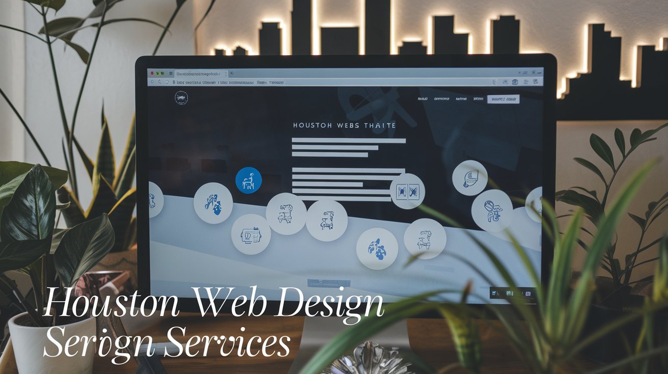
At Texas Web Design, we specialize in creating seamless dark mode experiences that improve readability and usability across all devices. Whether you’re updating an existing site or building a new one, our team ensures your dark mode design is user-friendly, visually appealing, and optimized for accessibility.
Want to enhance your website with dark mode? Contact us today, and let’s create an experience that keeps your users engaged.
What Is Dark Mode in Web Design?
Dark mode replaces bright backgrounds with darker shades while keeping text and interactive elements lighter. Platforms like Twitter, Instagram, and YouTube offer dark and light mode options, giving users more control over their viewing experience.
Beyond aesthetics, dark mode reduces blue light exposure, which helps lower eye strain and can improve sleep quality. On OLED and AMOLED screens, it conserves battery life by requiring less power to illuminate pixels.
Dark mode also plays an important role in accessibility. It improves contrast for users with visual impairments and enhances readability in low-light conditions. As more devices support system-wide dark mode, this feature has become a standard in modern web design.
Although dark mode offers benefits, readability must remain a priority. Using the right contrast levels and tools like Tailwind CSS and Bootstrap makes dark mode more effective and user-friendly.
Benefits of Dark Mode
Dark mode does more than change a website’s look. It enhances usability, improves viewing comfort, and provides a modern design option for users.
-
Reduced Eye Strain and Blue Light Exposure
 Bright screens can cause discomfort, especially in dark environments. Dark mode minimizes glare, making it easier to read content for long periods, particularly at night.
 -
Improved Focus on Content
A well-implemented dark mode reduces distractions, allowing users to concentrate on text, images, and videos more effectively.
-
Battery Efficiency for OLED and AMOLED Screens
Dark mode helps extend battery life on OLED and AMOLED screens by limiting the number of illuminated pixels, and reducing power consumption.
-
Modern and Stylish Appearance
Many users prefer the sleek, minimalist look of dark mode. Its growing adoption across major platforms reflects its widespread appeal.
-
Catering to User Preferences
Some users find dark mode more comfortable, while others prefer a traditional light background for extended reading. Offering both options makes websites more adaptable.
-
Accessibility Benefits
A significant portion of mobile users actively choose dark mode for better contrast and improved readability. Providing this option expands usability to a broader audience.
 Bright screens can cause discomfort, especially in dark environments. Dark mode minimizes glare, making it easier to read content for long periods, particularly at night.
Best Practices for Implementing Dark Mode
To make dark mode effective, web designers should focus on usability, readability, and design consistency.
Avoid Pure Black and White
Using pure black (#000000) and pure white (#FFFFFF) creates harsh contrasts. Instead, use dark grays like #121212 or #1E1E1E for backgrounds and light grays like #E0E0E0 for text. This reduces glare and improves readability.
Maintain Readable Contrast Levels
Good contrast improves accessibility. The WCAG (Web Content Accessibility Guidelines) recommends a contrast ratio of 4.5:1 for standard text and 3:1 for larger text. Tools like WebAIM’s Contrast Checker ensure proper visibility across devices.
Use Subtle Background Variations
Flat dark mode designs can feel dull. Adding slight variations in background tones creates depth and enhances visual hierarchy.
Choose Accent Colors Wisely
Accent colors should be bold enough to stand out but not overpowering. Muted, less saturated colors help maintain balance and readability.
Optimize Images and Media for Dark Mode
Bright images can be too intense in dark mode. Adjusting brightness levels or applying semi-transparent overlays helps images blend better with dark backgrounds.
Keep Focus Indicators Visible
Elements like outlines, highlights, and borders should remain visible. In dark mode, slightly brighter colors help users navigate the site more easily.
Test Across Various Lighting Conditions
Dark mode looks different in varying lighting environments. Testing helps identify contrast and readability issues, ensuring a consistent user experience.
Common Dark Mode Mistakes and How to Avoid Them
Dark mode can enhance the user experience, but only if implemented correctly.
Here’s how to avoid common pitfalls:
-
Avoid Simple Color Inversions
Flipping light mode colors doesn’t always work. Some elements may lose readability or contrast. Dark mode should be designed separately to ensure clarity and usability. -
Use Softer Whites for Text
Bright white text on a dark background can be too harsh. A light gray (#E0E0E0) provides a more comfortable reading experience while maintaining visibility.
-
Limit Bright Colors
Colors that work well in light mode may appear too strong in dark mode. Using muted tones keeps designs comfortable for extended viewing.
-
Test on Different Devices
Dark mode should be consistent across desktops, tablets, and smartphones. Testing ensures readability, contrast, and usability remain intact.
-
Use Shadows Thoughtfully
Shadows help define elements but should be subtle in dark mode to maintain balance.
 Flipping light mode colors doesn’t always work. Some elements may lose readability or contrast. Dark mode should be designed separately to ensure clarity and usability.
When Should You Use Dark Mode?
Dark mode works best for:
- Nighttime browsing: Reduces glare and lowers eye strain.
- Text-heavy websites: Creates a comfortable reading experience.
- Apps with long user sessions: Provides a more relaxed viewing option.
- Battery-conscious mobile users: Helps reduce power consumption on OLED screens.
Some visual adjustments may be needed for image-heavy designs to maintain clarity and contrast.
Making Dark Mode Work for Your Website
Dark mode isn’t just about switching colors—it’s about creating a better user experience. A well-designed dark mode improves readability, usability, and accessibility, making it a must-have feature for modern web design.
At Texas Web Design, we specialize in building dark-mode experiences that are smooth, accessible, and visually appealing. If you’re ready to add dark mode to your website, let’s bring your vision to life.
Call us today, and let’s create a modern, user-friendly design that keeps your audience engaged.