Responsive Design on Website Speed and Performance
The Impact of Responsive Design on Website Speed and Performance for San Antonio Businesses
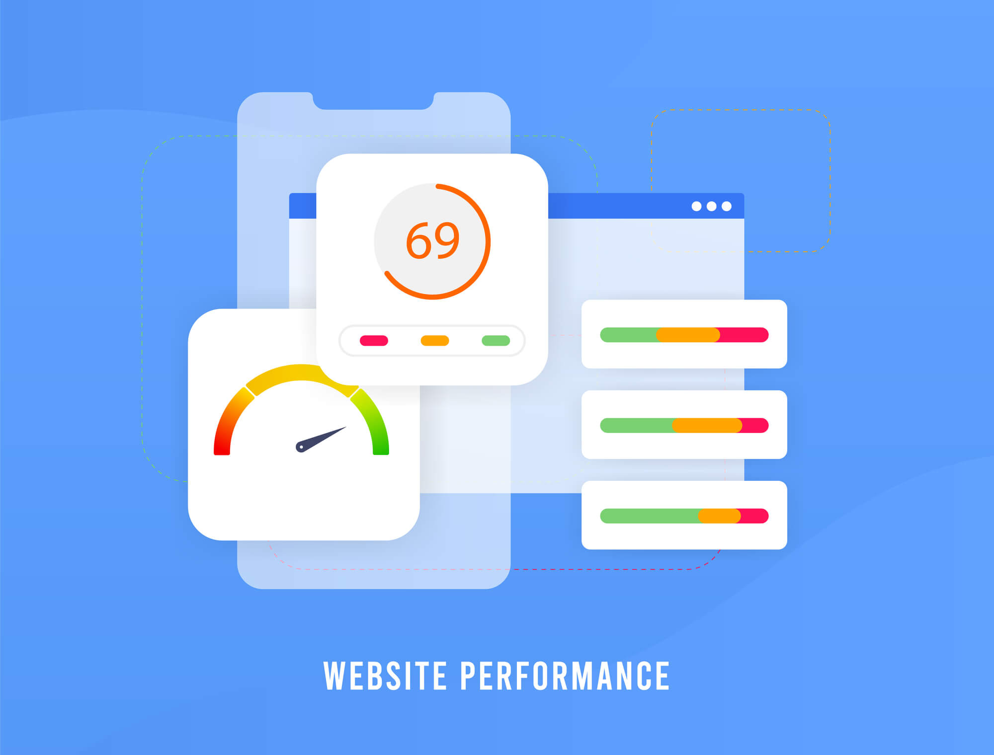
In today’s digital landscape, website speed, and performance play a critical role in optimizing the user experience and search engine rankings. One of the essential factors that contribute to this optimization is responsive web design. Implementing responsive design ensures that a website adapts to different devices and screen sizes, providing an improved and consistent browsing experience across various platforms.
Responsive design not only enhances the user experience and accessibility but also has a significant impact on a website’s speed and performance. By employing adaptive layouts and optimally serving media files, response times can be minimized and loading speeds maximized, resulting in a better overall performance score.
If you’re looking to optimize your website’s speed and performance through responsive design, contact Texas Web Design today to get started!
Get In Touch
Responsive design improves website speed by delivering appropriately sized assets for each device, using streamlined code, and serving a single URL that is easier for search engines to crawl. This reduces data load, prevents unnecessary resource requests, and improves user experience, leading to lower bounce rates and stronger SEO signals. It creates a faster, smoother experience across all devices by adapting layout and content to match the screen being used.
For San Antonio businesses, page speed is not just a technical concern. It directly affects whether visitors stay on your site long enough to contact you, and it is one of the factors Google uses to determine where your pages rank in local search results. If your site is slow on mobile, you are likely losing both visitors and search visibility.
At Texas Web Design, our team builds and optimizes responsive websites for businesses across San Antonio and Texas. If your site is slow on mobile or failing Core Web Vitals assessments, request a free performance audit or call 210-985-8528 and we will show you exactly what is holding your site back.
Fundamentals of Responsive Design
Responsive web design (RWD) is an approach to web design that delivers a consistent user experience across different devices and screen sizes. This design approach is built on three core principles:
Fluid Grids: Layouts built on relative units like percentages rather than fixed pixels enable websites to resize and adapt dynamically to any screen width.
Flexible Images: Images sized to fit their containing elements rather than fixed dimensions, so they scale correctly without overflowing or distorting on smaller screens.
Media Queries: CSS rules that detect the device’s screen width, height, and orientation and apply different layout styles accordingly.
One of the practical benefits of responsive design is that it maintains a seamless user experience as visitors move between devices. A visitor who browses your site on a desktop at the office and returns on their phone later gets a consistent experience both times.
Responsive design also has a direct effect on website speed and performance. By using media queries to serve appropriately sized images and content for each device, a responsive site reduces the amount of data transferred on mobile visits, which shortens load times and improves performance scores.
Responsive web design is a standard approach in modern web development. When implemented correctly, fluid grids, flexible images, and media queries work together to deliver sites that perform well across every device your visitors use.
Core Web Vitals and Responsive Design
Core Web Vitals are a set of performance metrics developed by Google to measure the real user experience on a website. According to Google Search Central, they are a confirmed ranking factor, meaning your scores directly affect where your pages appear in search results.
As of March 2024, Google updated the Core Web Vitals to three metrics: LCP, INP, and CLS. The previous interactivity metric, First Input Delay (FID), was retired and replaced by Interaction to Next Paint (INP), which is a stricter and more comprehensive measure of page responsiveness.
The current three Core Web Vitals are:
Largest Contentful Paint (LCP): Measures how long it takes for the largest visible content element on a page to load. Google’s threshold for a good score is under 2.5 seconds from when the page starts loading.
Interaction to Next Paint (INP): Measures how quickly the page responds to user interactions such as clicks, taps, and keyboard input throughout the entire visit. This metric replaced First Input Delay (FID) in March 2024. A good INP score is under 200 milliseconds, per Google Search Central.
Cumulative Layout Shift (CLS): Measures the visual stability of a page during loading. A good CLS score is under 0.1, meaning page elements do not shift unexpectedly as content loads.
Responsive design supports good Core Web Vitals scores in several ways. Serving device-appropriate images reduces LCP load time. Avoiding heavy fixed-layout JavaScript and using clean CSS reduces INP latency. Setting explicit dimensions on images and media elements prevents layout shifts that raise CLS scores.
For San Antonio businesses, you can check your site’s Core Web Vitals scores for free using Google PageSpeed Insights or visit our dedicated Core Web Vitals San Antonio page to learn more about what these scores mean for your local search performance.
Responsive Design Metrics to Monitor
Beyond Core Web Vitals, several engagement metrics help you understand how well your responsive design is working in practice.
Time on page: Visitors who can read and navigate your site comfortably on any device stay longer. A high average time on page suggests your responsive design is serving visitors well.
Click-through rate (CTR): A well-structured responsive site with clear calls to action on every screen size produces higher CTR, since buttons and links are accessible and easy to tap on mobile.
Bounce rate: A high bounce rate, particularly on mobile, often points to responsive design problems. Visitors who land on a page that is hard to read or navigate on their phone leave quickly. Monitoring bounce rates by device type helps isolate where the issues are.
User satisfaction: Direct feedback from customers or usability testing surfaces issues that analytics alone may not reveal, particularly on specific device types or older phone models.
Optimization Techniques for Responsive Website Speed
A responsive site that adapts visually to any screen is only part of the goal. Performance optimization makes sure it also loads quickly on any device and connection type.
Compression and Minification
Reducing file size is one of the most reliable ways to improve load times across all devices.
Compression: Gzip or Brotli compression reduces the size of CSS, JavaScript, and HTML files before they are sent from the server to the browser. Smaller file sizes mean faster download times, which matters more on mobile connections where bandwidth is limited.
Minification: Removing unnecessary characters such as spaces, comments, and line breaks from HTML, CSS, and JavaScript files reduces their size without affecting how they function. Tools like UglifyJS for JavaScript and CSS Minifier handle this automatically.
Image Optimization
Images are one of the most common causes of slow load times, particularly on mobile where bandwidth and processing power are more limited.
Choose the right format: JPEG works well for photographs. PNG handles images with transparency. WebP provides efficient compression for both types and is supported by all major browsers as of 2024.
Responsive images: Using the srcset and sizes attributes in HTML tells the browser to load the appropriately sized image for the device. A phone does not need to download the same full-resolution image as a 27-inch desktop monitor.
Image compression: Tools like TinyPNG and ImageOptim reduce file size without visible quality loss, using lossless and lossy compression algorithms.
Caching Strategies
Caching reduces the amount of data visitors need to download on repeat visits, improving perceived load times significantly.
Browser caching: Using Cache-Control and Expires headers tells browsers to store static resources like stylesheets, scripts, and images locally for a set period. Returning visitors load your site faster because their browser already has most of the files.
Content Delivery Network (CDN): A CDN serves your site’s files from a server geographically closer to each visitor, reducing latency and download times. For a San Antonio business with visitors across Texas, a CDN shortens the distance data travels on every request.
Server caching: Object caching, database query caching, and full-page caching reduce the processing work the server does on each request. Tools like Varnish, Memcached, and Redis handle this at the server level.
Challenges and Considerations
Resource Load Prioritization
One of the common challenges in responsive design is deciding the order in which resources load. The sequence affects how quickly visitors perceive the page as usable, even before it finishes loading completely.
Use lazy loading for images and content below the fold so they load only when the visitor scrolls to them, reducing the initial page weight.
Deliver responsive images using the srcset attribute so each device receives an appropriately sized file rather than a full-resolution image scaled down in the browser.
Minify and compress CSS and JavaScript files to reduce their size and speed up how quickly the browser can parse and apply them.
Use HTTP/2 where available, which allows multiple files to be transferred simultaneously rather than one at a time, improving overall load efficiency.
Cross-Platform Compatibility
A responsive site needs to perform consistently across different browsers, operating systems, and device types. Inconsistencies between how Chrome, Firefox, Safari, and Edge render CSS can create layout problems that only appear on specific combinations.
Browser compatibility: Test the site on Chrome, Firefox, Safari, Opera, and Edge to confirm consistent performance across all major browsers.
Device diversity: Validate the design on different operating systems including Windows, macOS, Android, and iOS, and on devices ranging from current flagship phones to older models with smaller screens.
Fallback options: Where a specific feature is not supported in older browsers, implement fallback behavior so the site remains functional for all visitors rather than breaking entirely.
The overall effect of responsive design on website speed and performance depends on how carefully these challenges are addressed. Well-prioritized resource loading and thorough cross-platform testing are what separate a responsive site that performs well from one that simply resizes.
Optimize Website Speed and Performance for Your San Antonio Business
Texas Web Design builds, redesigns, and optimizes responsive websites for businesses across San Antonio, Boerne, New Braunfels, Stone Oak, and throughout Texas. If your site is slow on mobile, failing Core Web Vitals assessments, or losing visitors before they contact you, contact our team or call 210-985-8528 for a free audit. We will run your site through Google PageSpeed Insights, identify exactly what is affecting your scores, and show you the highest-impact fixes to apply first.
Yes, when implemented correctly. Responsive design improves speed by serving appropriately sized images for each device using the srcset attribute, reducing the amount of data transferred on mobile visits. It also uses a single URL and codebase, which eliminates the overhead of maintaining a separate mobile site and consolidates all resources into one request path. For San Antonio businesses, faster load times on mobile directly affect both user experience and local search rankings, since Google uses page speed as a ranking factor.
Core Web Vitals are three performance metrics Google uses to measure real user experience and factor into search rankings. As of March 2024, the three metrics are Largest Contentful Paint (LCP), which measures how quickly the main content loads and should be under 2.5 seconds; Interaction to Next Paint (INP), which measures how quickly the page responds to user actions and should be under 200 milliseconds; and Cumulative Layout Shift (CLS), which measures visual stability during loading and should be under 0.1. For Texas businesses competing in local search, passing all three metrics gives your site a measurable advantage over competitors whose sites fall short of these thresholds.
Interaction to Next Paint (INP) replaced First Input Delay (FID) as the Core Web Vital for interactivity in March 2024, per Google Search Central. INP is a stricter metric than FID because it measures the page’s responsiveness to all user interactions throughout the entire visit, not just the very first one. A good INP score is under 200 milliseconds. Sites that passed FID comfortably may still fail INP, particularly if they have heavy JavaScript, third-party scripts, or complex page builders generating excessive code.
Images are one of the most common causes of slow load times on mobile, where bandwidth and processing power are more limited than on desktop. Using the srcset and sizes attributes in HTML tells the browser to load an appropriately sized image for each device, so a phone does not download the same full-resolution image as a desktop monitor. Choosing modern formats like WebP, which is supported by all major browsers, and compressing images with tools like TinyPNG or ImageOptim reduces file sizes further without visible quality loss. For San Antonio businesses, these improvements directly affect LCP scores and overall mobile load times.
Browser caching stores static resources like stylesheets, scripts, and images on the visitor’s device for a set period using Cache-Control and Expires headers. On a return visit, the browser loads these files from local storage rather than downloading them from the server again, which reduces load time noticeably. For a San Antonio business website, caching is particularly useful for repeat visitors such as existing customers checking business hours or services, since their experience improves with every visit as more resources are stored locally.
A Content Delivery Network (CDN) is a network of servers distributed across multiple geographic locations that cache and serve your site’s files from whichever server is closest to each visitor. This reduces the distance data travels on every request, lowering latency and improving load times. For San Antonio businesses serving customers across Texas, a CDN shortens delivery times for visitors in Dallas, Houston, Austin, and other cities without requiring changes to your hosting setup. Cloudflare is one of the most widely used CDN providers and offers a free tier suitable for most small business websites.
TESTIMONIALS
“
Love their attention to detail, very quick to respond to my marketing edits that were needed ..Would highly recommend for all your marketing needs!
Crystal M.
“
These guys are awesome!!! The best customer service and the best SEO Company in the San Antonio, Tx area!!
Jason Rozacky
“
Not only do their services work, but they are also a pleasure to work with. They are super responsive and go above and beyond to exceed expectations. Highly recommend!
Joshua P
“
Their service goes above and beyond and definitely exceeds expectations. They are professionals and I look forward to many long successful years with them as their client.
Walter Wilson
Our mission is to provide attainable marketing solutions and deliver the finest customer experience with proven results.