
The success of your online presence is measured by two crucial factors: the design of your website and its discoverability through search engines. In this age of multi-device usage, responsive web design has emerged as the cornerstone of user-friendly online experiences.
Coupled with the paramount importance of search engine optimization (SEO), it forms a dynamic duo that can significantly impact your online visibility and traffic.
Responsive web design is not merely a buzzword; it’s a fundamental shift in the way we approach web development.
At its core, responsive design is a methodology that empowers websites to adapt seamlessly to the diverse array of devices that users employ to access the web. Be it a towering desktop monitor, a sleek laptop, a tablet, or the ever-present smartphone, responsive web design ensures that your website looks and functions flawlessly on all of them.
No more pinching, zooming, or endless scrolling to access content. Instead, responsive design tailors your site’s layout and content presentation to the specific device, providing an optimal user experience.
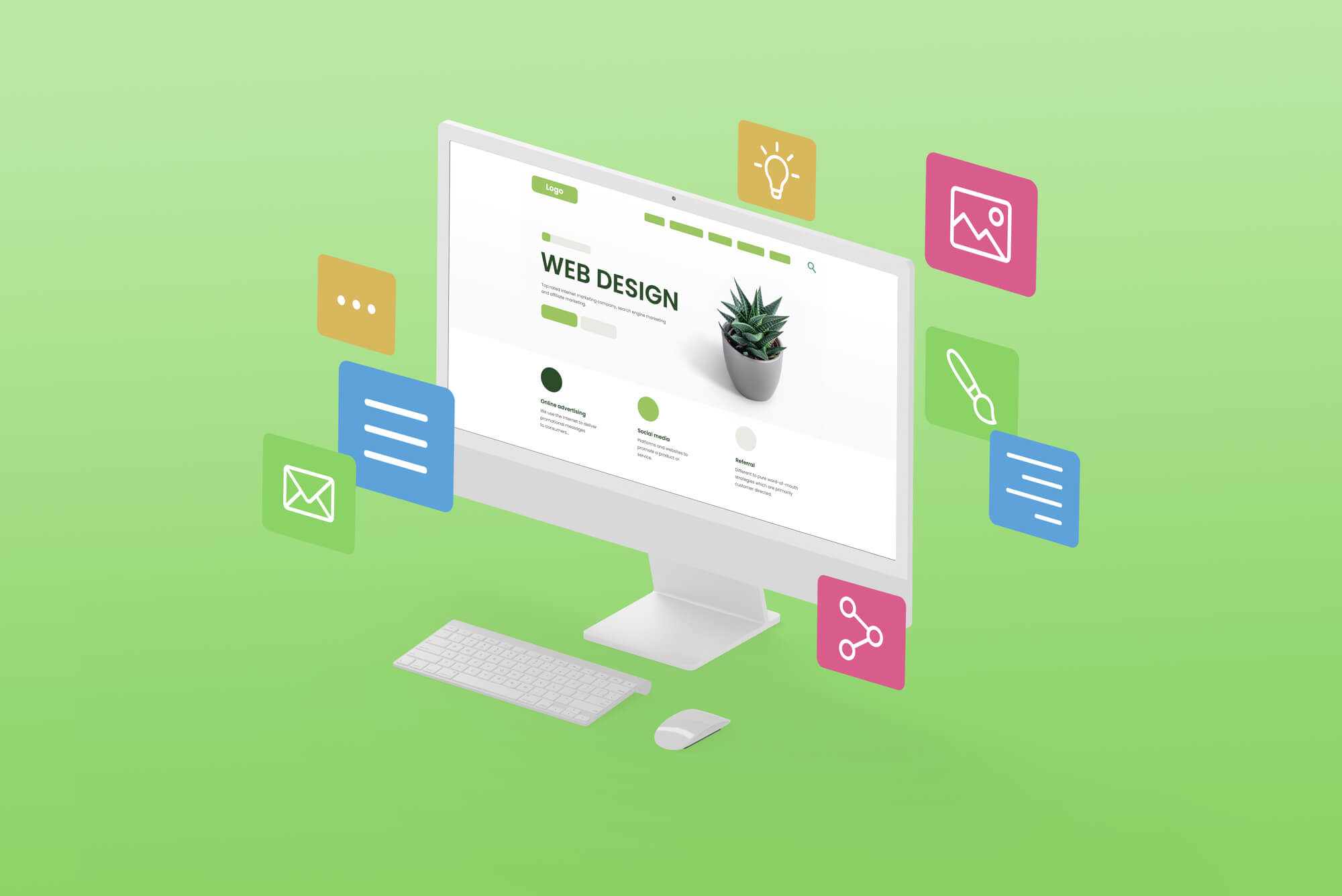
Let Texas Web Design help you create a website that converts visitors into buyers. Call us at 210-985-8528.
 Now, let’s pivot to the second pillar of our discussion: SEO, the driving force behind your website’s discoverability. SEO is akin to the signpost guiding users to your digital doorstep. It encompasses a myriad of strategies and techniques aimed at enhancing your website’s visibility on search engine result pages (SERPs).
Why is this important? Consider this: every day, millions of users turn to search engines like Google to find answers to their questions, products to purchase, or services to engage with. Being visible on the first page of search results can mean the difference between obscurity and online success.
This article will unpack the five SEO benefits that go hand in hand with responsive web design. Each of these benefits contributes to your website’s overall search engine performance, ultimately shaping your online presence and reaching the digital audience you aspire to engage.
Whether you’re a business owner, a web developer, or a curious digital enthusiast, understanding these benefits is key to harnessing the full potential of your website in the competitive online arena.
1. Improved Mobile Rankings
In the ever-changing landscape of SEO, it’s critical to stay ahead of the game. Lately, Google has made a significant change in its ranking algorithms, focusing heavily on mobile-friendly websites.
This change is driven by a good reason. As smartphones become more common and mobile internet use grows, Google is placing a priority on how websites perform on these devices. This adjustment has big implications for your website’s search rankings and how visible it is to the people you want to reach.
Google’s emphasis on mobile friendliness is a strategic response to changing user behavior. Today, users reach for their smartphones to access information, make purchases, and connect with the digital world. Google recognizes this shift and seeks to ensure that its search results align with user expectations.
As a result, the search giant rolled out a mobile-first indexing policy. This means that Google predominantly uses the mobile version of your website for indexing and ranking in search results, even for users on desktop devices.
This policy underscores the importance of mobile-friendly websites for SEO success.
The Impact of Responsive Design on Mobile Search Rankings
Enter responsive web design, a solution that’s tailor-made for the mobile-first world. Responsive design ensures that your website adapts seamlessly to various screen sizes and orientations.
Whether a user accesses your site on a smartphone, tablet, or desktop, they experience consistent content and functionality. Google rewards this adaptability by giving preference to responsive websites in mobile search rankings.
In essence, responsive design is a proactive approach to meeting Google’s mobile-first criteria, enhancing your website’s chances of securing higher positions in mobile search results.
2. Lower Bounce Rates
The bounce rate is the number of visitors who check out just one page on your site and then take off without clicking anything else.
Basically, it shows us how many visitors didn’t find what they were looking for or didn’t feel like sticking around to see more. Search engines, especially Google, pay attention to this.
If a lot of people are bouncing away from your site, it might look like your website isn’t giving people what they need. So, keeping your bounce rates low is a big deal for getting your site noticed in search results
When it comes to SEO, it’s important to understand and keep these rates low. This is where having a website that looks and works great on all devices, known as responsive web design, really helps. It makes your site more user-friendly, which can mean fewer people leave after just looking at one page.
How Responsive Design Reduces Bounce Rates
Imagine this: someone finds your site through a search, and it loads quickly, showing content that fits their screen perfectly.
They don’t have to pinch or zoom to read anything. Getting around is easy, and the whole experience is enjoyable. In cases like this, people are more likely to keep looking around your site, which lowers the bounce rate.
Responsive design creates a smooth and pleasant experience, making visitors want to explore more of what your site has to offer.
Responsive web design helps keep visitors interested and engaged, no matter what device they’re using. When your website is responsive, it means that people on smartphones, tablets, and computers all see a site that looks good and is easy to use.
The content is easy to read, the images fit the screen nicely, and it’s simple to find your way around. This consistent experience, no matter the device, makes it less frustrating for users and encourages them to explore.
3. Consolidated Content
Having different websites for mobile and desktop is old news. Responsive web design gives a complete solution by bringing all your content together under one URL.
This not only makes it easier to manage your website but also deals with the problem of having the same content in different places, which can affect how well your site shows up in search engines.
Challenges With Separate Mobile and Desktop Websites
 Not long ago, the common way to serve mobile users was to have a different website just for them, with its own web address, look, and content. But even though it made sense at the time, it brought a lot of problems.
Having two separate websites meant doing everything twice: updating content, making sure it shows up in search engines, and keeping everything working right.
Plus, it could lead to differences between the mobile and desktop sites, making things confusing for users.
Benefits of a Single URL Structure for All Devices
Responsive web design saves the day by using one web address that works well on any device. With this approach, your website’s content stays the same no matter what device someone is using.
You don’t have to worry about having the same thing in different places or different versions for different devices.
When someone visits your site on a phone, tablet, or computer, they all see the same web address, making everything consistent. This makes it easier to manage your website and keeps things simple for search engines.
Preventing Duplicate Content Issues and Their SEO Implications
Having the same content in multiple places can cause problems for SEO.
When search engines find the same or very similar content on different web addresses, they get confused about which one to show in search results. This can make it harder for people to find your site. Plus, search engines might give your site a lower ranking because of the repeated content.
Responsive design tackles these issues by using just one web address for all devices. When someone visits a responsive site from different devices, the content adjusts to fit the screen, but it stays on the same web address.
This makes it easier for search engines to figure out what to show in search results; they only have to deal with one version of each page.
By avoiding the problem of repeated content, responsive design helps keep your site’s SEO strong and unaffected by content duplication.
4. Faster Page Loading
Page loading speed is a critical factor that significantly impacts the user experience and search engine rankings.
Responsive web design plays a huge role in improving page loading times and offering a faster and more efficient browsing experience.
The Importance of Page Loading Speed in SEO
Having the same content in different places can cause trouble for SEO. When search engines find the exact or very similar content on different web addresses, they get stuck trying to figure out which one to show in search results.
This can make it harder for people to find your site. Plus, search engines might give your site a lower ranking because of the repeated content.
Think of page loading speed in SEO as a busy marketplace. The users are the customers, and the search engines are the gatekeepers. When people come to your site, they want things to load quickly and smoothly.
If the pages take too long to load, it can annoy people and make them leave your site, which isn’t good. Search engines, especially Google, know that people like fast-loading pages, which is why they use loading speed as one of the things that affects how high your site shows up in search results.
Pages that load quickly not only make users happy but also help your site show up better in searches.
How Responsive Design Often Leads to Faster Loading Times
Responsive web design is built to be fast. It gets rid of the need for separate mobile and desktop sites, making it easier to give people what they want.
With responsive design, everyone sees the same stuff, no matter what they’re using. This means less work for the server and fewer files to download, so responsive sites usually load quickly, giving people a good experience.
Imagine someone with a slow internet connection looking at a responsive site on their phone. The site changes the pictures and layout to fit the small screen, and because it only sends what’s needed, the page loads fast.
This makes it less frustrating for people with slow connections. Being able to work well on different devices helps keep people interested and less likely to leave your site.
Tools and Techniques to Optimize Page Speed for Responsive Websites
Optimizing page speed for responsive websites involves a combination of techniques and tools. These include:
- Compressing images to reduce file sizes without compromising quality.
- Minifying CSS and JavaScript to reduce the size of code files.
- Enabling browser caching to store website elements locally on the user’s device.
- Leveraging Content Delivery Networks (CDNs) to distribute content from servers geographically closer to users.
- Prioritizing above-the-fold content loading to ensure users see the most critical parts of the page first.
Incorporating these strategies and utilizing tools such as Google PageSpeed Insights or GTmetrix can help optimize page speed for responsive websites, enhancing both user satisfaction and SEO performance.
Faster page loading times, facilitated by responsive web design, are essential for a positive user experience and improved search engine rankings.
In the competitive online landscape, where user expectations are high and attention spans are short, responsive design stands as a valuable asset in ensuring that your website not only loads quickly but also retains user engagement and ranks favorably in search results.
5. Easier Management
When it comes to managing websites and SEO, keeping things simple can be helpful. Responsive web design gives you an easy way to keep everything in one place, making it simpler to manage your online presence.
By focusing on just one responsive website, you can make your SEO plans better and lower the chances of making mistakes or having things not match up.
Challenges of Managing Multiple Site Versions
Not long ago, it was normal to have different versions of a site for different devices. But that brought a lot of problems. Having separate sites for mobile and desktop meant dealing with different content, designs, and features.
It made it hard to update things, meant doing extra work for SEO, and often made the mobile and desktop sites different from each other. This could make things harder for people using the site and affect how well the site shows up in search results.
Streamlined SEO Efforts with a Single Responsive Website
Responsive web design makes SEO easier by putting everything in one place—your website. With responsive design, you keep the same web address, content, and design for all devices.
This makes it easier to do SEO. You only have to make one website work well for both phones and computers. This means you save time and don’t have to deal with the problems of managing different versions of the site.
Think about having one website where changes you make on one device happen on all the others too.
That means when you make things better for search engines, add new stuff, or make the design nicer, it happens for everyone. This makes sure your SEO plans stay clear, all focusing on one main place for content.
Reduced Risk of Errors and Inconsistencies in Content, Metadata, and Backlinks
Mistakes and mixed-up information can mess up your SEO. When you have different websites for mobile and desktop, it’s easy for things to not match up – like the words, details about the site, and links to other places.
This can make search engines and people confused, which might make your site show up lower in search results and make people trust your site less.
Responsive web design helps fix this by making everything look the same on all devices. This means the words and details are the same, and the links all go to the same main place.
This makes it less likely to have mistakes or things that don’t match up, which makes your site do better in searches.
Final Thoughts
Throughout this article, we’ve explored the five SEO benefits that responsive web design bestows upon websites:
- Improved Mobile Rankings: Responsive design aligns seamlessly with Google’s mobile-first indexing, elevating your website’s mobile search rankings.
- Lower Bounce Rates: By offering a consistent and user-friendly experience across all devices, responsive design reduces bounce rates and fosters engagement.
- Consolidated Content: A single URL structure eliminates the pitfalls of duplicate content and bolsters your website’s SEO performance.
- Faster Page Loading: Responsive websites tend to load faster, enhancing both user satisfaction and SEO rankings.
- Easier Management: Managing one responsive website streamlines SEO efforts while reducing the risk of errors and inconsistencies.
The message is clear: prioritize mobile friendliness for both search rankings and user satisfaction. In an era where mobile devices reign supreme and user expectations for a seamless experience are sky-high, responsive web design offers a compelling solution.
It ensures that your website looks and functions flawlessly on smartphones, tablets, and desktops, enhancing its discoverability, user engagement, and ultimately, its success.
Responsive web design is a bridge to the future of online visibility and engagement. As you navigate the ever-changing waters of the digital world, remember that responsiveness isn’t an option—it’s a strategic imperative.
Embrace it, optimize it, and watch as your website not only scales the SEO rankings but also becomes a beacon of user satisfaction and digital excellence.
The path to success in the digital realm begins with responsiveness, and the journey continues as you adapt to the evolving needs and expectations of your audience.