
The principles of good web design revolve around several key concepts, including simplicity, navigation ease, consistency, accessibility, and responsiveness.
This post from Texas Web Design covers what makes a website good and how these principles can work in any business.
Why Web Design Matters
Web design impacts how users perceive and interact with a website, setting the stage for their first impression of a brand.
Beyond aesthetics, good design enhances usability and the user experience, making a site more intuitive and easier to navigate. It also ensures accessibility, allowing people of all abilities to access and benefit from a site’s content.
Consistent design elements reinforce brand identity and build trust among visitors. Web design also plays a role in search engine optimization (SEO), influencing a website’s visibility in search engine results and affecting its ability to attract more visitors.
Strategic design choices can improve conversion rates by guiding users toward desired actions, such as making a purchase or signing up for information. In competitive markets, a well-designed website can provide a competitive edge, distinguishing a brand from its rivals with a more compelling online presence.
Ultimately, effective web design is not just about looks; it’s about creating a positive, efficient, and inclusive user experience that supports the site’s goals and enhances its performance.
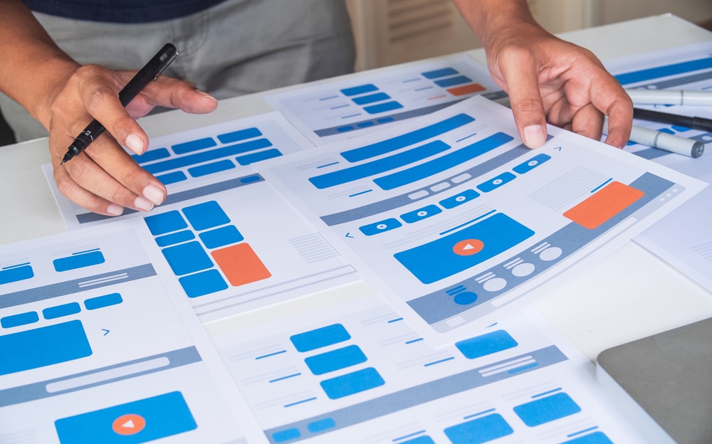
Good Web Design Principles
1. A Good Web Design Should Be Simple
Keep it simple. Steer clear of overloading your webpage with too many elements. Your website should have a few elements but at the same time have functional elements such as buttons, contact forms, and a menu. A straightforward and uncluttered design can help visitors navigate it easily.
2. Visual Hierarchy
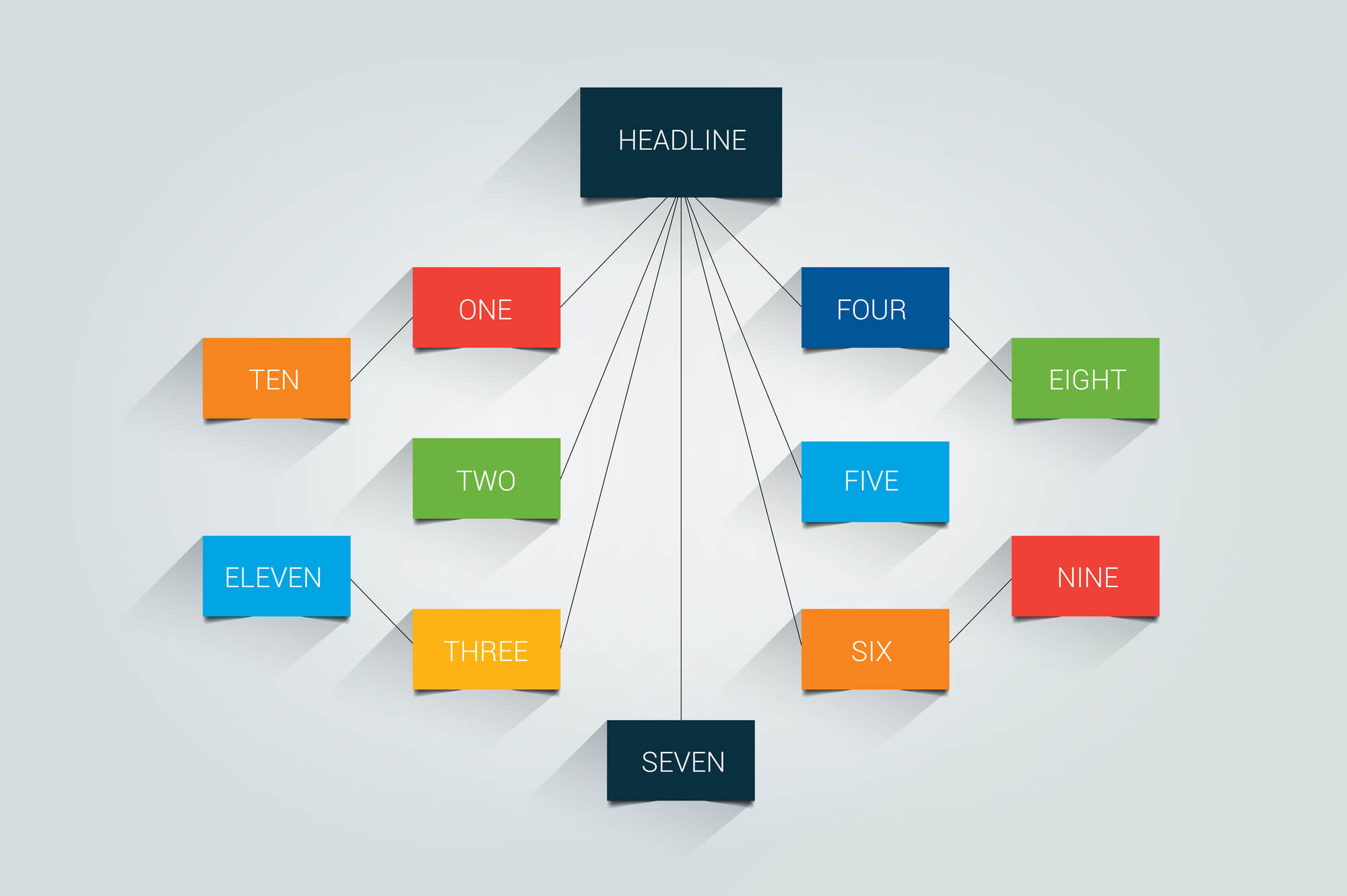 Visual hierarchy is an important web design rule that helps direct visitors’ attention to the most important parts of your website. It involves organizing elements so that people naturally look from one item to the next.
Designers use things like size, color, pictures, contrast, and text styles to set up this order and guide how users move through the site.
3. User-Friendly Navigation
 Visitors should not struggle to find information. A well-structured layout with well-thought-out navigation points, such as menus and buttons, helps them find their way around your site.
4. Responsiveness
A website should adapt to any screen on any device. Making your site responsive on desktop and mobile ensures visitors can easily navigate your website. Examples include making your website’s text and images clear on mobile, making menus easily accessible, and making contact forms functional across different screen resolutions.
5. Loading Time
The loading time of your web pages directly affects the user experience, bounce rates, and ultimately your site’s success. Optimizing images, minifying CSS and Javascript, and leveraging browser caching all contribute to a principle that guarantees a faster, more seamless experience for your visitor.
6. Emphasis on Typography
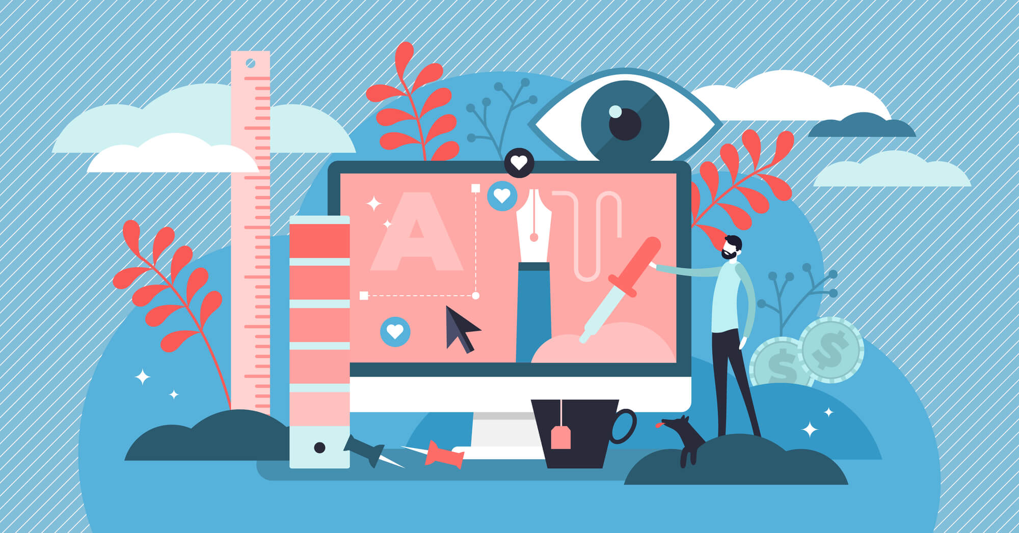 Fonts matter. They carry the voice of your brand.
The right typeface will encourage reading, while the wrong one might put the visitor off. Balance the need for unique, brand-aligned fonts with readability and user experience. Go for simpler styles, such as Montserrat.
Font size is important, too. It’s all about balancing bigger and smaller fonts. Using bigger fonts is meant to drive attention towards a service, product, or your business’ UVPs (unique value propositions).
7. Consistency
Keep your design and branding consistent across all pages. From fonts and colors to the style of images and icons, consistency reinforces recognition, strengthens your brand, and enhances the user experience.
8. Color and Contrast
Colors can set the mood of the site and highlight important information, while contrast ensures that text and other elements stand out, making the content readable.
Using different colors and contrast effectively can guide visitors’ attention to important areas, improve the user experience, and make a website more accessible to everyone, including those with visual impairments.
In short, smart use of color and contrast is crucial for creating a visually appealing and functional website.
9. F-Layout and E-Layout
Web users typically browse websites following an “F” or “E” pattern, meaning they scan pages from the top down and from left to right. This behavior starts with users looking horizontally across the top of the page, then moving down a bit and scanning across again, forming the top two bars of the “F.”. As they continue, they scan vertically down the left side of the page, creating the spine of the “F” or “E.”
Placing key information and calls to action (CTA) along these patterns will make them more likely to be seen and acted upon by visitors, thus improving the overall user experience and interaction with your site.
This strategic alignment not only makes the website more intuitive and navigable for users but also leverages natural scanning habits to highlight important information effectively.
10. White Space
Also known as “negative space,” it is an area between elements on your website. More space means more clarity and a higher focus on your content. But be sure to balance this with the need for engaging content and visual excitement.
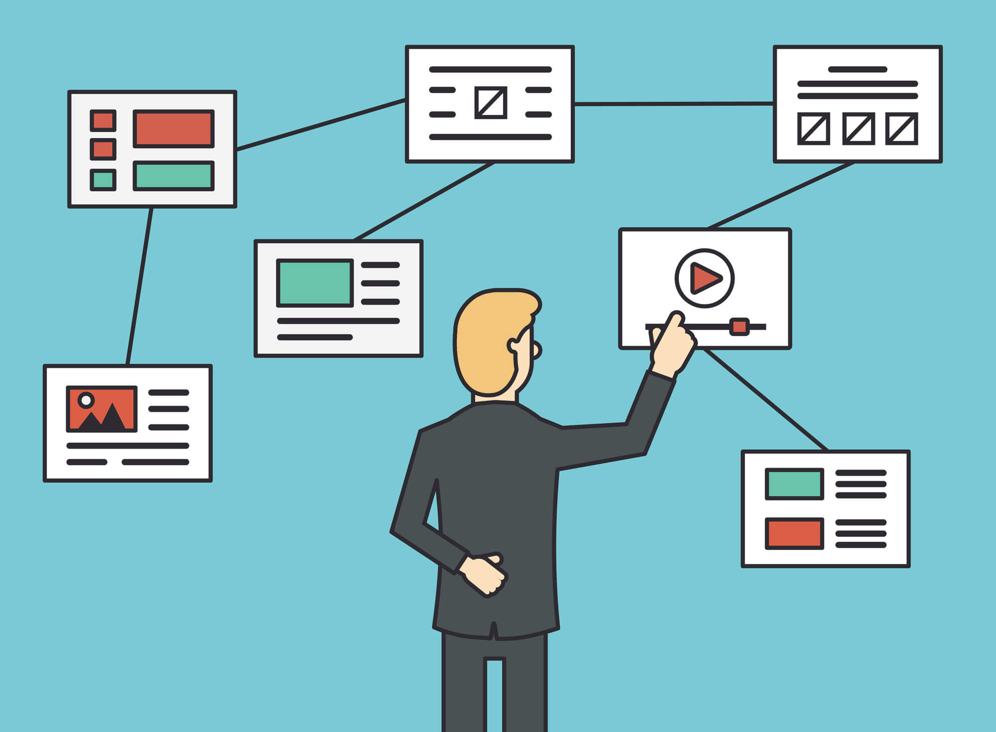
11. Use of Images
Images can break up text, making content more appealing. They should be high-quality and relevant to the content, helping to illustrate points and add visual interest.
Images also enhance the overall look and feel of a website, contributing to its atmosphere and emotional appeal.
The downside of adding images is that a website will slow down if there are too many of them. You should optimize your images by compressing images and other files to avoid slowing your website down.
12. Mobile-First Design
Mobile-first design is a web design principle that prioritizes creating websites for mobile devices before making versions for desktops. This approach ensures that websites are accessible and user-friendly on smaller screens, which is essential since more people now use smartphones for browsing the web than computers.
This ensures that the site’s most important features are easy to use on any device and improves the overall user experience.
Mobile-first design also helps with search engine rankings, as search engines favor mobile-friendly websites. This design strategy involves using flexible layouts, touch-friendly navigation, and optimizing images and content to load quickly on mobile connections.
13. Accessibility
Good designs are inclusive. They consider all possible types of users, including those with disabilities. Make your designs accessible by considering color contrast for the color blind, text alternatives for images, or easy-tab navigation for those unable to use a mouse.
14. Communication
Websites are communication tools. Good designs are those that communicate effectively with their visitors. Organizing information using headlines and subheads and using bullet points instead of lengthy sentences can enhance the communication principle further.
15. Credibility
A website can be the first interaction a user has with a business. It’s crucial that your website authentically represents your business and helps to build trust with your users. Ensuring your website is well-designed, easy to navigate, and transparent will make it appear more credible.
Wrapping Up
These proven tips are essential for making websites that look great and work well, attracting and keeping the audience’s attention.
By mastering these principles and keeping the user’s needs in focus, designers can create websites that are not only beautiful but also easy and enjoyable to use, ensuring the website’s success. Contact us today to learn more!