Responsive Design’s Impact on User Engagement and SEO
How Responsive Design Impacts SEO and User Engagement for San Antonio Businesses
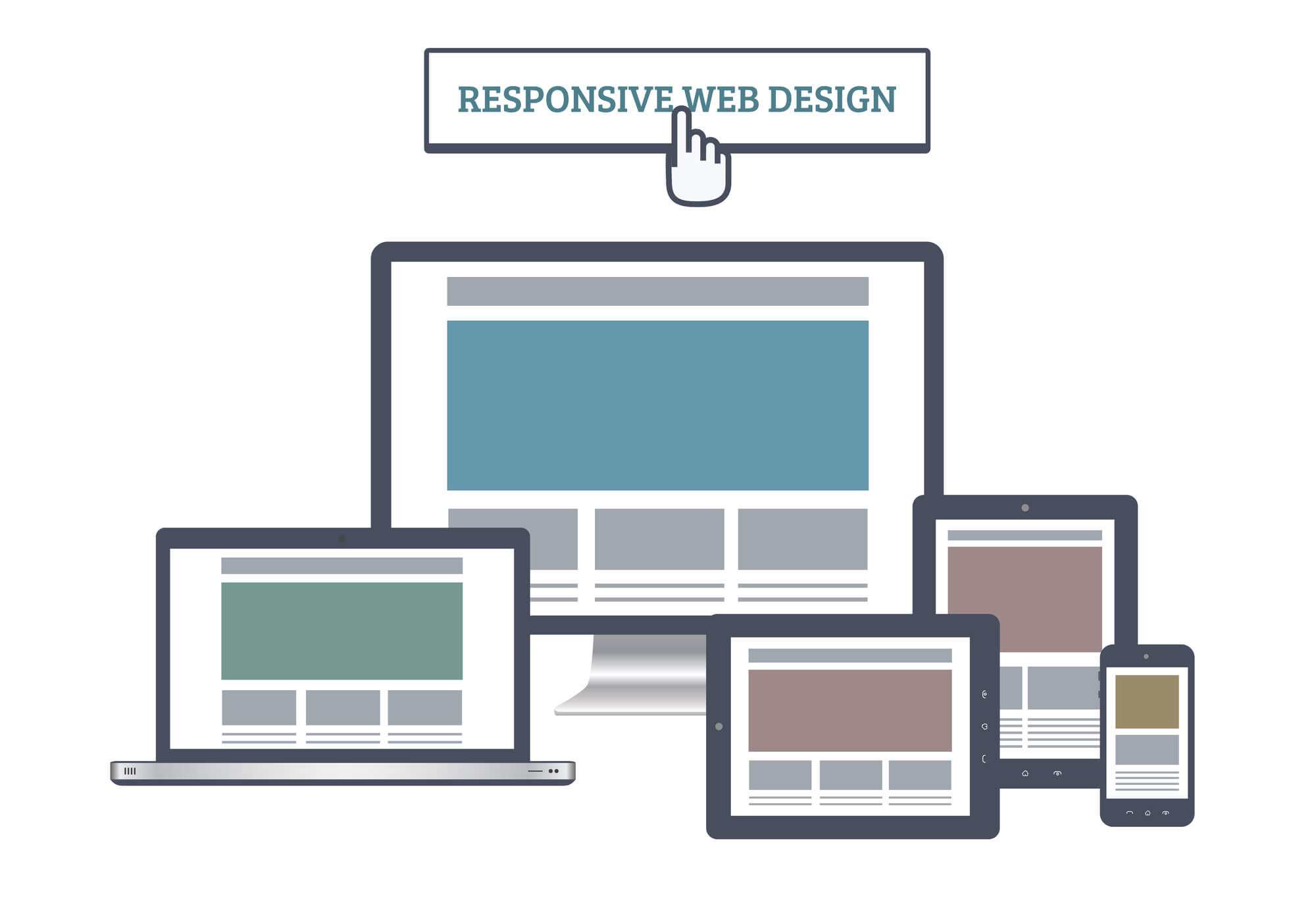
Responsive design has moved from being a luxury to becoming a necessity in today’s digital world. It significantly influences user engagement and the SEO performance of a website. Nowadays, people access the internet using various devices. Therefore, websites must adapt and fit every screen size and platform, ultimately sustaining user interest and enhancing their interaction with the website.
Additionally, search engines tend to favor sites that are conveniently usable on mobile devices, thereby improving the website’s visibility and search result ranking. Embracing responsive design allows businesses to cater to a broader audience and provides a substantial boost to their SEO.
Get In Touch
At Texas Web Design, our team builds and optimizes responsive websites for businesses across San Antonio and Texas. A site that works correctly on every device is one of the most practical investments a local business can make for search visibility and customer experience. If your current site is losing mobile visitors, request a free responsive design auditor call 210-985-8528 and we will show you specifically what needs to change.
How Responsive Design Improves User Engagement
According to StatCounter data compiled by Statista, mobile devices accounted for approximately 58.5 percent of global web traffic in 2025. For San Antonio businesses, that means the majority of visitors arriving at your website are likely doing so from a phone. Whether they stay or leave in the first few seconds depends largely on whether your site adapts correctly to their screen.
Responsive sites tend to have lower bounce rates because visitors find content accessible and readable without needing to zoom, scroll sideways, or fight with navigation. A visitor using a smartphone will stay longer when text is legible, buttons are tappable, and pages load without layout problems.
Beyond bounce rate, a well-built responsive site increases time on page because visitors can move through content naturally on any device. That leads to more page views per session and a better overall signal to Google that your site is serving its visitors well.
Touch-Friendly Interactivity
Responsive design shapes how visitors interact with content on phones and tablets, not just how it looks.
It supports touch-friendly interfaces with buttons and links sized appropriately for fingers rather than mouse cursors.
Visitors engage naturally through swiping, tapping, and pinch-to-zoom on touchscreen devices.
Content adjusts based on device orientation, so rotating from portrait to landscape does not break the layout.
Hover-dependent interactions from desktop are replaced with touch-compatible alternatives so nothing requires a mouse to function.
Navigational Simplicity on Mobile
Navigation is one of the first things visitors evaluate on a mobile site. If menus are hard to open, links are too small to tap, or paths to important pages are buried, visitors leave.
Responsive sites use streamlined menus designed for one-handed mobile use, typically collapsing into a hamburger icon on smaller screens.
Clear call-to-action buttons are sized and placed consistently across all screen sizes, guiding visitors toward contact forms, phone calls, or purchases regardless of the device they are using.
Simplified paths to conversion points reduce friction on any device type, which is a direct factor in improving the actions visitors take on your site.
Responsive Design as an SEO Factor
Google uses the mobile version of your website as the primary basis for indexing and ranking. This is called mobile-first indexing, and Google completed its full rollout in July 2024, meaning every website is now evaluated through its mobile version first, per Google Search Central’s official documentation.
For San Antonio businesses, this has a direct practical effect. A site that looks and performs well on mobile is more likely to rank well in local search results, including the Google Map Pack, than a comparable site with poor mobile performance.
Sites that adapt cleanly to different screen sizes send stronger mobile usability signals to Google.
Responsive sites maintain a single URL for all devices, which keeps all ranking signals consolidated rather than splitting them across a separate mobile subdomain.
A mobile-optimized site is more likely to rank well in search results than one that is not built responsively, particularly for the kind of local searches San Antonio customers use to find nearby businesses.
Accessibility and Responsive Design
Responsive design and web accessibility share several overlapping goals. Both require content to be readable at different text sizes, navigable without a mouse, and structured with clear headings and labels.
The Web Content Accessibility Guidelines (WCAG), published by the W3C, set the standards that most accessibility compliance requirements reference. Responsive design helps meet several of these guidelines by default.
Readability features that responsive design supports:
Text resizing and adjustable contrast ratios improve readability for visitors with visual impairments.
Properly structured responsive layouts are more compatible with screen readers used by visitors who are blind or have low vision.
Voice navigation compatibility:
Responsive layouts that use semantic HTML structure work more reliably with voice navigation tools.
This supports visitors who rely on voice commands to navigate websites rather than touch or mouse input.
Performance and Page Speed
Page speed is a Google ranking factor and a direct driver of bounce rate. Responsive design supports faster load times through several technical approaches.
Optimized and properly sized images reduce the amount of data transferred on each page load, which matters more on mobile connections where bandwidth is limited.
Lazy loading defers images and content below the fold until the visitor scrolls to them, reducing initial load time without removing content.
A site that loads quickly and adjusts correctly to the visitor’s screen keeps users engaged longer and performs better in both user experience metrics and SEO rankings.
Current Trends Shaping Responsive Design in 2026
Responsive design continues to evolve as new device types and browsing behaviors emerge. San Antonio businesses building or updating their sites in 2026 should be aware of three developments that affect how responsive design is approached.
Progressive Web Apps (PWAs): PWAs allow websites to behave like native apps on mobile devices, including offline access and fast loading from the home screen. They extend the reach of responsive design by giving mobile visitors an app-like experience without requiring an app store download.
Foldable and non-standard screens: Foldable phones introduce screen ratios that fixed breakpoint systems can struggle with. Responsive builds using fluid grids and relative units handle these edge cases more gracefully than pixel-based fixed layouts.
Voice search optimization: As voice search use grows across mobile devices, sites need to be structured with natural language content and clear semantic markup so voice search results can surface the right answers. Responsive design that uses clean HTML structure supports this directly.
Build a Responsive Website That Performs for Your San Antonio Business
Texas Web Design builds, redesigns, and optimizes responsive websites for businesses across San Antonio, Boerne, New Braunfels, Stone Oak, and throughout Texas. If your site is losing mobile visitors, ranking below competitors in local search, or simply does not reflect the quality of your business on a phone screen, contact our team or call 210-985-8528 for a free audit. We will show you exactly how your site scores on mobile performance and what needs to change.
Yes. Visitors are more likely to leave a site immediately when it is hard to read or navigate on their device. Responsive design reduces bounce rates by making content accessible and readable on any screen without requiring visitors to zoom, scroll sideways, or struggle with navigation. According to StatCounter data compiled by Statista, mobile devices accounted for approximately 58.5 percent of global web traffic in 2025, which means most visitors arriving at a San Antonio business website are doing so from a phone and will bounce quickly if the experience is poor.
Mobile-first indexing means Google crawls and evaluates the mobile version of your website as the primary basis for determining where your pages rank in search results. Google completed the full rollout of mobile-first indexing in July 2024, per Google Search Central, meaning every website is now evaluated this way with no exceptions. For San Antonio businesses competing in local search, a site that is not optimized for mobile will generally rank lower than a comparable site that is, regardless of how well the desktop version performs.
Responsive design improves user engagement by removing the friction that causes visitors to leave. When text is readable without zooming, buttons are large enough to tap, and navigation works naturally on a phone, visitors stay longer, view more pages, and are more likely to contact your business. For Texas service businesses where a phone call or contact form submission is the goal, these improvements in on-page behavior directly affect how many visitors turn into actual inquiries.
Responsive design supports several requirements from the Web Content Accessibility Guidelines (WCAG), published by the W3C, which is the standard most ADA accessibility compliance requirements reference. Features like adjustable text sizing, sufficient color contrast, and semantic HTML structure that responsive design relies on also benefit visitors with visual impairments, those using screen readers, and users who rely on voice navigation. For San Antonio businesses concerned about ADA compliance exposure, a properly built responsive site is generally better positioned than a fixed-layout site.
Page speed is a Google ranking factor and a direct driver of whether visitors stay or leave. Responsive design supports faster load times by serving appropriately sized images for each device, using lazy loading to defer off-screen content, and avoiding the overhead of maintaining a separate mobile site. For San Antonio businesses trying to rank in local search, running your site through Google’s PageSpeed Insights at pagespeed.web.dev shows your mobile performance score and the specific Core Web Vitals metrics Google uses when evaluating page experience as part of its ranking process.
A responsive website uses a single URL and a single codebase that adapts automatically to any screen size. A separate mobile site uses a different URL, typically something like m.example.com, and requires maintaining two versions of the site. Google recommends responsive design over separate mobile sites because it consolidates all ranking signals to one URL, avoids duplicate content issues, and is simpler to keep updated. For Texas businesses managing their own websites, a separate mobile site that falls out of sync with the desktop version can create indexing problems and inconsistent experiences for local visitors.