Essential Steps to Ensure Your Website is Fully Responsive
How to Tell If Your San Antonio Business Website Is Fully Responsive
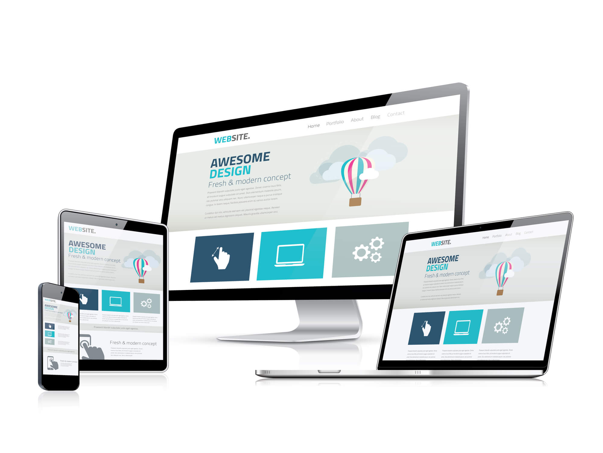
In today’s digital age, having a responsive website is crucial for business success. With the increasing use of mobile devices, it’s important to ensure that your website looks and functions well on all screen sizes. A responsive website, coupled with effective web design, adapts and adjusts its layout based on the device being used, providing an optimal user experience.
But how can you be sure that your website is truly responsive? In this post, we will discuss some effective methods to test and ensure that your website is fully responsive.
Take the first step towards a seamlessly responsive website with Texas Web Design—your partner in creating an outstanding online presence.
Contact us today to optimize your website for responsiveness and elevate your online presence!
Get In Touch
Understanding Responsive Design
Responsive web design is a foundational approach in web development that gives a website the ability to adapt its layout, images, and typography to fit any screen size, from a desktop monitor to a phone held in one hand.
The three building blocks of responsive design are flexible grids, media queries, and fluid images. Flexible grids use relative units like percentages instead of fixed pixel values so layouts scale proportionally. Media queries are CSS rules that apply different styles at specific screen widths. Fluid images resize within their containers without overflowing or distorting. Together, these three elements allow a single website to serve every visitor well, regardless of the device they are using.
For San Antonio businesses, this matters because a visitor who finds your site through a local search on their phone will judge your business in seconds based on how that page loads and displays. A site that adapts correctly reinforces professionalism. One that breaks apart or requires zooming signals the opposite.
Responsive design delivers good viewing experiences on any device.
Flexible grids and layouts adjust automatically to the screen size in use.
Media queries apply targeted styles based on the device’s characteristics.
Fluid images resize proportionally, keeping visuals sharp without overflowing their containers.
A well-built responsive site reduces friction for visitors and keeps them on the page longer.
As of July 2024, Google uses the mobile version of every website as the primary basis for indexing and ranking, making responsiveness a direct factor in local search performance.
At Texas Web Design, our team audits and builds responsive websites for businesses across San Antonio and Texas. If you are not sure whether your current site holds up on mobile, request a free responsiveness audit or call 210-985-8528 and we will show you exactly where things break down.
Strategies for Testing Website Responsiveness
Responsive testing tells you whether your site actually works for visitors on different devices, not just whether it looks good on your own screen. Here are three approaches, from quickest to most thorough.
Manual Resizing
The fastest starting point is manual resizing: drag the edge of your browser window inward and watch how your site responds. Well-built responsive sites reflow their content smoothly at every width. Problem sites will show text that becomes unreadable, images that overflow their containers, or navigation that collapses in ways that make it unusable.
Check that text, images, and other content stay readable and properly proportioned as the window narrows.
Note the specific widths where the layout breaks, and these are your problem breakpoints.
CSS media queries should be handling the transitions between layouts at those widths. If they are not, that is where fixes need to happen.
Emulators and Simulators
Browser-based emulators and simulators let you preview how your site appears on different devices without needing to own each one physically. Google Chrome DevTools includes a built-in device toolbar that simulates dozens of screen sizes and device types directly in the browser.
Simulators are fast and useful for catching obvious layout problems during development.
They show how designs translate across different device types and operating systems.
Their limitation is that they do not fully replicate real-world conditions, including actual touch responsiveness, mobile browser rendering differences, or how the site performs on a slower cellular connection.
Real Device Testing
Testing on actual phones and tablets gives you the most accurate picture of what your visitors experience.
Testing on real hardware covers a range of devices, including older models with smaller screens and slower processors that many San Antonio customers may be using.
Real device testing surfaces issues that simulators miss, including tap accuracy on small buttons, readability in different lighting conditions, and how the site handles slower mobile network speeds.
Tools for Testing Responsiveness
Browser Developer Tools
Every major web browser includes built-in developer tools that make responsive testing straightforward without installing anything extra.
Viewport adjustment: Chrome DevTools, Firefox Developer Tools, and Safari Web Inspector all let you set an exact pixel width to simulate a specific screen size.
Device presets: Chrome DevTools includes presets for common devices including iPhone, Pixel, iPad, and Samsung Galaxy models, so you can preview at real-world dimensions quickly.
Cross-browser compatibility: Browser tools also help confirm your site works consistently across Chrome, Firefox, Safari, and Edge, since rendering differences between browsers can affect how responsive layouts display.
Online Testing Tools
Online platforms let you test your site’s appearance on a wide range of devices without owning the hardware. These services run in the cloud, so you can test from anywhere at any time.
Cloud-based tools let you test across hundreds of device and browser combinations without physical constraints.
They are particularly useful for catching device-specific rendering issues that do not appear in browser simulators.
Automation Software
Automated testing tools run responsiveness checks as part of a development workflow, catching layout regressions before they reach live visitors.
Faster routine checks: Automated tests run quickly and repeatedly, catching problems introduced by code changes without requiring manual review every time.
Continuous integration compatibility: Many automation tools integrate with CI/CD pipelines, so responsiveness is checked automatically on every new build.
Consistent coverage: Once set up, automated tests run the same checks every time with no variation, reducing the chance of a problem slipping through.
Recommended Responsive Design Testing Tools
Here is a breakdown of the most practical tools for testing your site’s responsiveness, with a note on what each one is best for.
Visual preview at common phone and tablet screen sizes
Fast visual check across popular device widths
Free
Google PageSpeed Insights is the most important starting point for San Antonio business owners because it uses the same data Google uses to evaluate your site’s mobile performance for search rankings. It scores your site from 0 to 100 on mobile and desktop separately and identifies specific issues to fix. Run it at pagespeed.web.dev, with no account or installation needed.
Using User Feedback to Identify Responsiveness Problems
Technical tools catch many issues, but real users often surface problems that automated checks miss, particularly on older devices or unusual screen sizes.
Structured User Testing
Recruit a small group of people to navigate your site on their own devices and observe what they do.
Ask testers to complete specific tasks, like finding your contact information or navigating to a service page, rather than just browsing freely.
Watch for hesitation, accidental taps, zooming, or abandonment, as these behaviors identify friction points that may not show up in technical audits.
Ask testers to describe what felt confusing or difficult, not just what broke outright.
Note which device and browser each tester used, since problems often appear only on specific combinations.
Analyzing and Acting on Feedback
Once you have collected feedback, look for patterns across multiple testers rather than treating each comment individually.
Group issues by category: layout problems, navigation difficulties, slow load times, or hard-to-tap elements.
Prioritize fixes that affect the most visitors or that block the most important actions on the page, like calling your business or submitting a contact form.
Focus on changes that reduce friction first — things that prevent visitors from doing what they came to do.
Build a Responsive Website That Works for Your San Antonio Business
Texas Web Design builds, audits, and optimizes responsive websites for businesses across San Antonio, Boerne, New Braunfels, Stone Oak, and throughout Texas. If you are not confident your current site holds up on mobile, or if you want to know exactly how Google scores your site’s mobile performance, contact our team or call 210-985-8528 for a free audit. We will run your site through the same tools Google uses and show you specifically what needs to change.
Love their attention to detail, very quick to respond to my marketing edits that were needed ..Would highly recommend for all your marketing needs!
Crystal M.
“
These guys are awesome!!! The best customer service and the best SEO Company in the San Antonio, Tx area!!
Jason Rozacky
“
Not only do their services work, but they are also a pleasure to work with. They are super responsive and go above and beyond to exceed expectations. Highly recommend!
Joshua P
“
Their service goes above and beyond and definitely exceeds expectations. They are professionals and I look forward to many long successful years with them as their client.
The quickest check is to open your website on a smartphone and look for three things: whether the content fits the screen without horizontal scrolling, whether the text is readable without zooming, and whether buttons and links are large enough to tap without missing. For a more detailed picture, run your URL through Google PageSpeed Insights at pagespeed.web.dev, which gives you a free mobile performance score and flags specific issues affecting how your site displays and loads on phones.
Google PageSpeed Insights is the most practical free tool for most San Antonio business owners because it uses the same data Google uses to evaluate your site’s mobile performance for search rankings. It scores your site from 0 to 100 on mobile and desktop separately and provides specific recommendations for improvement. Chrome DevTools is also free and built into every Chrome browser, letting you simulate dozens of device sizes without leaving your browser window.
Google does not apply a separate penalty for non-responsive sites, but it does use the mobile version of your site as the primary basis for indexing and ranking. Google completed its full rollout of mobile-first indexing in July 2024, meaning every website is now evaluated through its mobile version first. A site that performs poorly on mobile will generally rank lower than a comparable site that is properly optimized, regardless of how well the desktop version performs.
Manual resizing means dragging your browser window to different widths to see how the layout responds. It is fast and useful for catching obvious breakpoints where the layout falls apart. Real device testing means loading your site on an actual smartphone or tablet, which reveals issues that manual resizing misses, including how touch interactions work, how readable the text is at arm’s length, and how the site performs on a slower mobile data connection. Both methods are worth doing, and neither replaces the other.
CSS media queries are rules written into a website’s stylesheet that tell the browser to apply different layout styles at specific screen widths or device orientations. For example, a media query can instruct the site to display a single-column layout on screens narrower than 600 pixels while showing a three-column layout on wider screens. Without media queries, a website uses the same fixed layout at every screen size, which causes text and images to overflow or become unreadably small on phones.
Open your website in Google Chrome, then right-click anywhere on the page and select Inspect. In the DevTools panel that opens, click the device toggle icon at the top left of the panel, which looks like a phone and a tablet overlapping. This activates the device toolbar, where you can select preset devices like iPhone, Pixel, or iPad, or enter a custom screen width to see exactly how your site responds at that size. You can also switch between portrait and landscape orientations to test both.
Yes. Automated tools and browser simulators catch layout and performance issues, but real users on their own devices often surface problems that do not appear in testing environments. Common examples include buttons that are technically the right size but feel too small on a particular phone model, forms that are hard to complete with a mobile keyboard, or navigation patterns that confuse users even when they technically function. Recruiting a small group of people to complete specific tasks on your site and observing where they struggle is one of the most reliable ways to find these gaps.
Test after any major update to your site, including theme changes, plugin updates, new page layouts, or significant content additions, since these can introduce new layout or performance issues on mobile. Beyond update-triggered testing, a quarterly check using Google PageSpeed Insights and manual testing on a current smartphone is a reasonable baseline for most San Antonio businesses. If you add new sections, forms, or interactive features, test those specifically on mobile before publishing.

 Responsive design delivers good viewing experiences on any device.
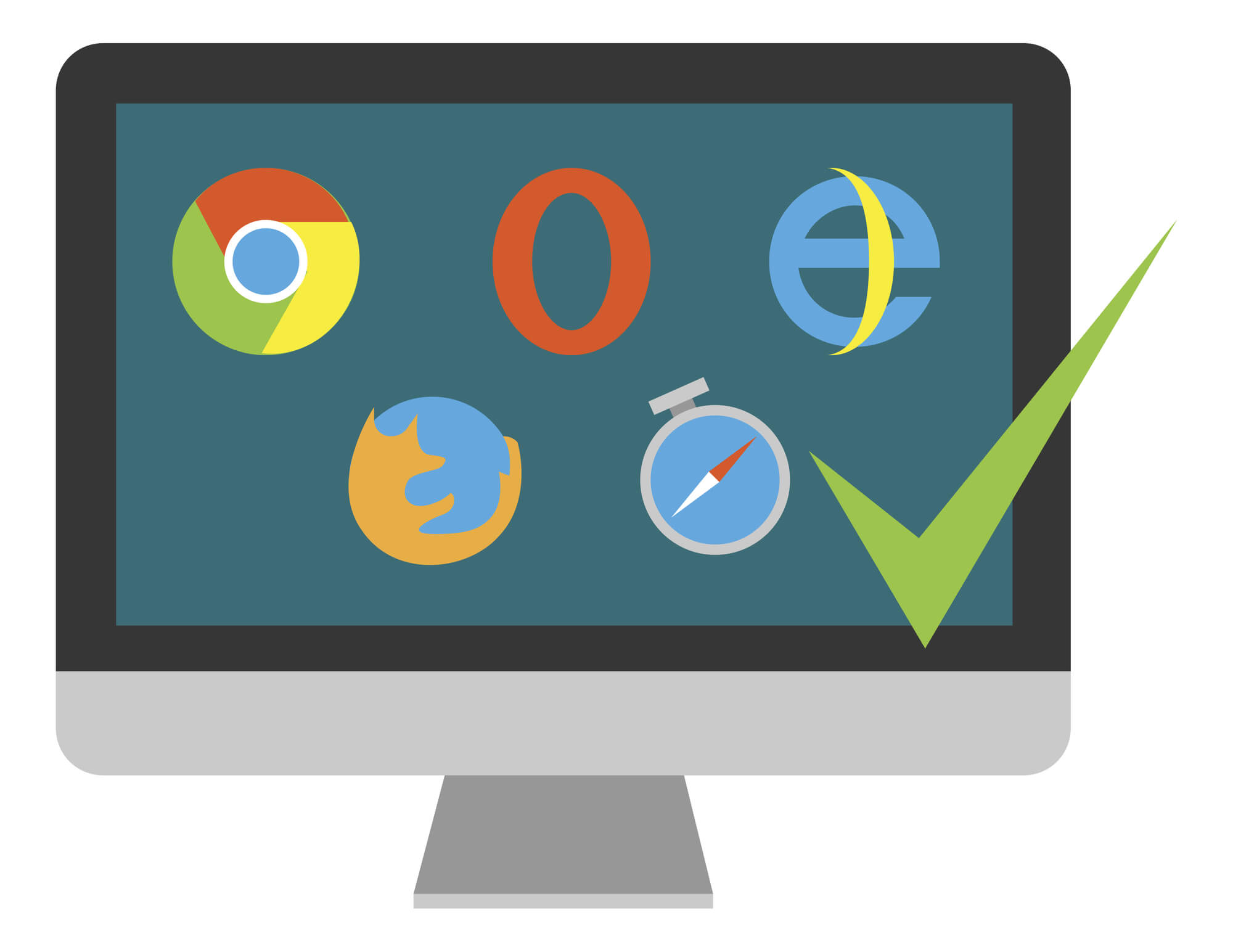 Viewport adjustment: Chrome DevTools, Firefox Developer Tools, and Safari Web Inspector all let you set an exact pixel width to simulate a specific screen size.