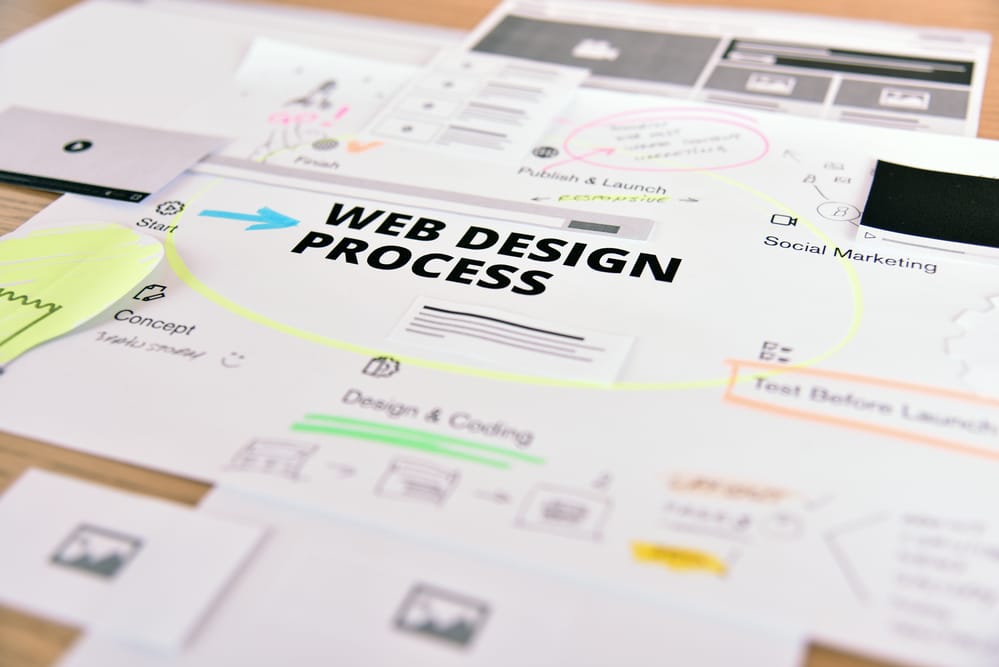
Enhancing Your Website’s Responsiveness with WordPress
How to Improve WordPress Responsiveness for Your San Antonio Business Website
Optimize your website’s adaptability across devices effortlessly with WordPress.
Utilize its versatile range of themes and plugins designed to enhance responsiveness, ensuring your content looks great on screens of all sizes.
With WordPress, easily customize and tailor your site’s design to create a seamless user experience, aligning your web presence with modern standards.
Get In Touch
Maximizing Responsiveness: Improving Your WordPress Website
The adaptability of a website across devices is important for engaging users. This adaptability relies on mobile-friendly themes and plugins that adjust your site to any screen size, improving user experience and search engine rankings.
For San Antonio businesses running WordPress sites, getting responsiveness right is one of the most practical things you can do for local search performance. According to W3Techs, WordPress powers 43 percent of all websites on the internet as of 2025 — making it the most widely used content management system in the world by a wide margin. With that kind of adoption, the ecosystem of responsive themes, plugins, and optimization tools available to WordPress users is deeper than any other platform.
Texas Web Design builds and optimizes responsive WordPress sites for businesses across San Antonio, Boerne, New Braunfels, and throughout Texas. If your WordPress site does not hold together on mobile the way it should, request a free responsive design audit or call 210-985-8528 and we will show you exactly what needs to change.
Understanding Website Responsiveness
Responsiveness in web design refers to a website’s ability to adapt to the screen size and orientation of the user’s device.
The layout and content dynamically resize and reorganize to create a readable and navigable experience without the need for horizontal scrolling, zooming, or resizing by the user.
When a website is built with responsiveness in mind, it uses fluid grids, flexible images, and media queries to deliver content effectively, whether on desktop monitors, tablets, or smartphones.
In the context of WordPress, themes and plugins are used to make sure a website is fully responsive. WordPress developers create themes that incorporate responsive design principles so that users can maintain the usability of their site on any device.
Why Mobile Responsiveness Matters for Your WordPress Site
Smartphones and tablets now account for the majority of internet traffic globally. Websites that work well for mobile users reach more of their audience and hold visitors on-page longer — both of which matter for conversions and local search rankings.
Google completed its full rollout of mobile-first indexing in July 2024, meaning it now uses the mobile version of every website as the primary basis for indexing and ranking. A WordPress site that performs poorly on mobile will rank lower than a comparable site that is properly optimized, regardless of how good the desktop version looks.
A mobile-responsive WordPress site also improves user experience in ways that directly affect business outcomes: visitors stay longer, navigate more pages, and are more likely to call, fill out a form, or make a purchase. Users who land on a site that is hard to use on their phone will move on quickly.
WordPress Themes for Responsiveness
When improving a WordPress site’s responsiveness, selecting the right theme is the first and most important decision. The theme controls how your site’s layout, typography, and visual elements adapt across screen sizes.
Selecting a Responsive Theme
The first step in making sure your WordPress site is responsive is choosing a theme built with responsiveness in mind. Responsive themes dynamically adjust their layout to provide a good viewing experience across a wide range of devices.
Look for themes that are frequently updated and well-supported, with strong feedback for their responsive design performance. Here are four well-regarded options for San Antonio businesses:
Theme
Best For
Page Builder
Notable Feature
Astra
Small business, service sites
Elementor, Beaver Builder, Gutenberg
Extremely lightweight — loads fast out of the box
Divi
Custom design, marketing pages
Built-in Divi Builder
Visual drag-and-drop with responsive controls per breakpoint
Avada
Multipurpose, larger sites
Fusion Builder
Extensive pre-built templates with mobile preview built in
Kadence
Performance-focused sites
Gutenberg, Elementor
Full Site Editing support with header/footer builder
Customization matters: the theme should let you adjust headers, footers, and layout elements without editing code directly.
Customizing Themes for Mobile Devices
Once a responsive theme is installed, customizing it for mobile is the next step. Most modern themes include built-in customizers that let you adjust elements specifically for smaller screens.
Test regularly: Check the site’s performance on real devices — not just browser simulators — to confirm the theme performs as expected across screen sizes.
Streamline menus: Mobile menus should be accessible, with a clear hierarchy and tap-friendly link sizes.
Prioritize content: Use collapsible sections for lengthy content to keep mobile pages scannable without hiding information from search engines.
Plugins to Improve WordPress Responsiveness
WordPress users have a wide range of plugins available to improve their site’s performance and responsiveness across devices.
Caching for Faster Load Times
Caching plugins reduce load times by storing static versions of your pages, cutting down on server processing for each visit. W3 Total Cache and WP Super Cache are two widely used options. Both reduce the work the server does on each page load, which translates to faster delivery on mobile connections where bandwidth is more limited.
Image Optimization Plugins
Images are one of the most common causes of slow load times on mobile. Plugins like Smush and EWWW Image Optimizer compress images without visible quality loss and automatically convert uploads to modern formats like WebP. They also resize images so they are not unnecessarily large on smaller screens.
Responsive Slider Plugins
For sites using image sliders or gallery sections, responsive slider plugins make sure those elements work on touch devices. Soliloquy and Slider Revolution both adjust to different screen sizes and support swipe gestures on mobile, so sliders do not become a frustration point for phone users.
WordPress Customization Techniques
Using Media Queries
Media queries are the CSS mechanism that makes responsive design work. They tell the browser to apply different layout rules depending on the screen size, height, or orientation of the device being used. WordPress themes use media queries to control how your site looks at each breakpoint.
Common media query targets:
Small devices (max-width: 600px) — phone layouts
Medium devices (max-width: 768px) — tablet layouts
Landscape orientation (orientation: landscape) — rotated phone or tablet
This is the technique that makes a WordPress site’s responsiveness adapt to the user’s viewport rather than forcing every visitor into a fixed layout.
Leveraging the WordPress Customizer
The WordPress Customizer is a built-in tool that lets you preview design changes in real time before publishing them. From the Customizer, you can adjust:
Site layout and column structure
Color schemes and background settings
Typography, font sizes, and line spacing
The live preview feature means you can see how adjustments affect mobile and desktop views side by side, which makes responsive fine-tuning faster and less error-prone than editing code directly.
Content Adaptation for Mobile Visitors
Adaptive Content Layouts
A responsive WordPress site does not just resize — it reflows content to match the screen it is on. A three-column layout on desktop might collapse to a single column on mobile. Flexible grid systems and responsive images handle this automatically when the theme is built correctly.
For businesses working with WordPress responsive design, this means the same content that looks structured on a large screen stays readable and scannable on a phone, without requiring a separate mobile site to manage.
Use flexible grids to create fluid layouts that reflow at any width
Use media queries to apply layout-specific styles at each breakpoint
Make sure images are responsive so they scale within their containers without overflowing
Typography and Readability on Mobile
Typography choices that look fine on a 27-inch monitor can become unreadable on a phone. A responsive WordPress site adjusts font sizes, line heights, and letter spacing per breakpoint so text stays comfortable to read at any screen size.
Avoid large blocks of unbroken text. Shorter paragraphs, clear subheadings, and well-spaced bullet points all help mobile visitors scan and absorb content without having to work for it.
Use legible fonts and set appropriate base font sizes for mobile viewports
Adjust line-height and letter-spacing so text does not appear cramped on small screens
Break content into shorter paragraphs to improve readability on mobile without removing information
Testing and Ongoing Optimization
Tools for Testing Mobile Responsiveness
Responsive testing should happen on real devices as well as browser-based tools. The Google Chrome DevTools device toolbar lets developers view a site at any simulated screen size directly in the browser. Platforms like LambdaTest and BrowserStack simulate a wide range of real devices and operating systems, which is useful for catching issues that only appear on specific hardware.
For performance, Google’s PageSpeed Insights provides a free audit of mobile load times, Core Web Vitals scores, and specific recommendations for improvement. This is the tool to use for understanding how your site scores on the metrics Google actually uses in its ranking process.
Ongoing Mobile Optimization in 2026
Responsive optimization is not a one-time task. As WordPress releases updates, themes evolve, and new devices enter the market, sites need to be retested and adjusted. In 2026, this includes considering foldable devices, which introduce new screen ratios that fixed breakpoint systems can struggle with.
WordPress’s Full Site Editing, available in WordPress 6.0 and later, gives site owners more direct control over responsive layouts across headers, footers, and page templates without requiring custom CSS for every change. Keeping themes updated and using a block-based approach where possible makes ongoing responsive maintenance significantly easier. Our web development team handles these updates for San Antonio clients as part of ongoing site maintenance.
Speed and Performance Optimization
Page speed is part of responsiveness. A site that technically adjusts to mobile screen sizes but loads slowly on a phone still delivers a poor experience. Three areas matter most for WordPress speed on mobile.
Minimizing HTTP Requests
Every element on a page — images, scripts, stylesheets — requires a separate server request. Reducing the number of requests speeds up initial page load. Combining stylesheets, consolidating scripts, and using CSS for simple visual elements instead of image files all reduce the request count.
Optimizing Database Performance
WordPress stores all content, settings, and user data in a database. Over time, unused data, post revisions, and plugin residue accumulate and slow down database queries. Regular maintenance using a plugin like WP-Optimize — which clears out unnecessary data and optimizes database tables — keeps query times fast.
Leveraging Browser Caching
Browser caching stores frequently accessed resources on the visitor’s device so that repeat page loads do not require re-downloading everything from scratch. W3 Total Cache handles this alongside its standard caching functions, reducing load times for returning visitors and improving overall site performance scores.
User Experience and Navigation
Mobile-Friendly Navigation Menus
Navigation is where many WordPress sites fall apart on mobile. Desktop menus with multiple levels and small text links become nearly unusable on a phone screen without adjustment.
Responsive WordPress themes handle this by collapsing desktop menus into a hamburger icon on smaller screens. For this to work well, the mobile menu needs:
Collapsed menus or hamburger icons on smaller screens to save space without hiding navigation entirely.
Large, tappable text links with enough spacing to prevent accidental taps on the wrong item.
A clear hierarchy that matches how visitors actually move through the site, not just how the desktop layout is organized.
Touchscreen Readiness
Responsiveness on touchscreen devices is not just about scaling content — it is about making sure every interactive element works reliably with a finger rather than a mouse cursor. For WordPress site owners, this means:
Buttons and call-to-action elements with enough padding to prevent mis-taps.
Image galleries and sliders optimized for swipe gestures rather than click-and-drag.
Forms and input fields that are touch-optimized, with large enough tap targets and keyboard-appropriate input types.
Build a Responsive WordPress Site That Works for Your San Antonio Business
Texas Web Design builds, redesigns, and optimizes responsive WordPress websites for businesses across San Antonio, Boerne, New Braunfels, Stone Oak, and throughout Texas. If your current WordPress site is slow, inconsistent on mobile, or losing visitors before they contact you, contact our team or call 210-985-8528 for a free audit. We will identify exactly what is holding your site back on mobile and show you what a properly optimized WordPress site looks like for your industry.
Start by making sure your WordPress theme is built for responsiveness — meaning it uses fluid grids, flexible images, and CSS media queries to adjust the layout at different screen sizes. From there, add a caching plugin like W3 Total Cache to improve load times, an image optimization plugin like Smush to reduce file sizes, and test the result using Google’s PageSpeed Insights at pagespeed.web.dev. Texas Web Design handles this process for San Antonio businesses from theme selection through performance testing.
Astra, Divi, Avada, and Kadence are among the most widely used responsive WordPress themes for small business sites. Astra is lightweight and loads fast out of the box, making it a strong choice for businesses where page speed matters for local search. Divi offers a visual drag-and-drop builder with responsive controls at each breakpoint. Kadence supports WordPress Full Site Editing, which gives businesses more direct control over headers, footers, and layout templates without custom code.
Google does not treat WordPress sites differently from other platforms, but it does evaluate every site based on its mobile version first. Google completed its full rollout of mobile-first indexing in July 2024, meaning the mobile version of your WordPress site is now the primary basis for how Google indexes and ranks your pages. A WordPress site that loads slowly or breaks on mobile will rank lower than a comparable site that is properly optimized, regardless of how the desktop version performs.
Three categories of plugins make the biggest difference for mobile performance. Caching plugins like W3 Total Cache and WP Super Cache store static versions of your pages, reducing server load and speeding up delivery on mobile connections. Image optimization plugins like Smush and EWWW Image Optimizer compress and resize images automatically, which directly reduces page weight on smaller screens. Database optimization plugins like WP-Optimize clean out unused data and post revisions that slow down WordPress query times over time.
Full Site Editing, available in WordPress 6.0 and later, lets you control the layout of every part of your site — including headers, footers, and page templates — using the block editor, without writing custom CSS. For responsiveness, this matters because it gives site owners direct control over how layouts adapt at different screen sizes across the entire site, not just individual pages. Keeping your theme updated and using a block-based approach where possible makes ongoing responsive maintenance significantly
The quickest check is to open your site on a real smartphone and look for horizontal scrolling, text that requires zooming to read, or buttons that are too small to tap reliably. For a more detailed audit, use Google Chrome’s built-in DevTools device toolbar to simulate different screen sizes, or run your URL through Google’s PageSpeed Insights at pagespeed.web.dev for a full report on mobile performance, Core Web Vitals scores, and specific issues to fix.
TESTIMONIALS
“
Love their attention to detail, very quick to respond to my marketing edits that were needed ..Would highly recommend for all your marketing needs!
Crystal M.
“
These guys are awesome!!! The best customer service and the best SEO Company in the San Antonio, Tx area!!
Jason Rozacky
“
Not only do their services work, but they are also a pleasure to work with. They are super responsive and go above and beyond to exceed expectations. Highly recommend!
Joshua P
“
Their service goes above and beyond and definitely exceeds expectations. They are professionals and I look forward to many long successful years with them as their client.
Walter Wilson
Our mission is to provide attainable marketing solutions and deliver the finest customer experience with proven results.

 When improving a WordPress site’s responsiveness, selecting the right theme is the first and most important decision. The theme controls how your site’s layout, typography, and visual elements adapt across screen sizes.
 Page speed is part of responsiveness. A site that technically adjusts to mobile screen sizes but loads slowly on a phone still delivers a poor experience. Three areas matter most for WordPress speed on mobile.