
Image optimization for a San Antonio business website means compressing image files, using modern formats like WebP or AVIF, setting correct dimensions, and loading images in the right order so pages stay fast without sacrificing visual quality. According to the latest Web Almanac, images account for approximately 37% of total page weight on the median homepage, making them the single largest contributor to slow load times. Unoptimized images directly hurt Core Web Vitals scores, search rankings, and the number of visitors who stay long enough to contact a business.
Navigation Design Best Practices
Website Navigation Design Best Practices for San Antonio Businesses
Get In Touch

A visitor lands on a San Antonio business website with one goal: to find something. A phone number, a list of services, a price range, a way to book. If your navigation does not put that answer within reach in the first few seconds, most visitors will not look harder. They will leave.
At Texas Web Design, we have seen this pattern across every industry in San Antonio. Businesses invest in design, photography, and content, then lose the lead because the menu structure made it too hard to find the contact page. If your site is hard to navigate, a free website consultation can show you exactly where visitors are getting stuck. Call 210-985-8528 and we will walk you through it.
Why Navigation Is the Most Underestimated Part of Web Design
Navigation is the first system a visitor uses on your website. It tells them where they are, where they can go, and whether this site is worth their time. When it works well, visitors do not notice it. When it fails, they feel the friction immediately and act on it.
Research from Clutch shows that 49% of customers abandon websites they find confusing to navigate. For a San Antonio service business, every one of those abandoned visits represents a lead that went to a competitor with a clearer, easier website.
Navigation also affects how search engines evaluate your site. Google uses mobile-first indexing, meaning the mobile version of your website is what determines your search rankings. A navigation that works on desktop but collapses into a confusing mess on a phone is not just a user experience problem. It is also a local SEO problem that limits how visible your business is in San Antonio search results.
Core Navigation Design Principles for San Antonio Business Websites
Keep the main menu focused and limited
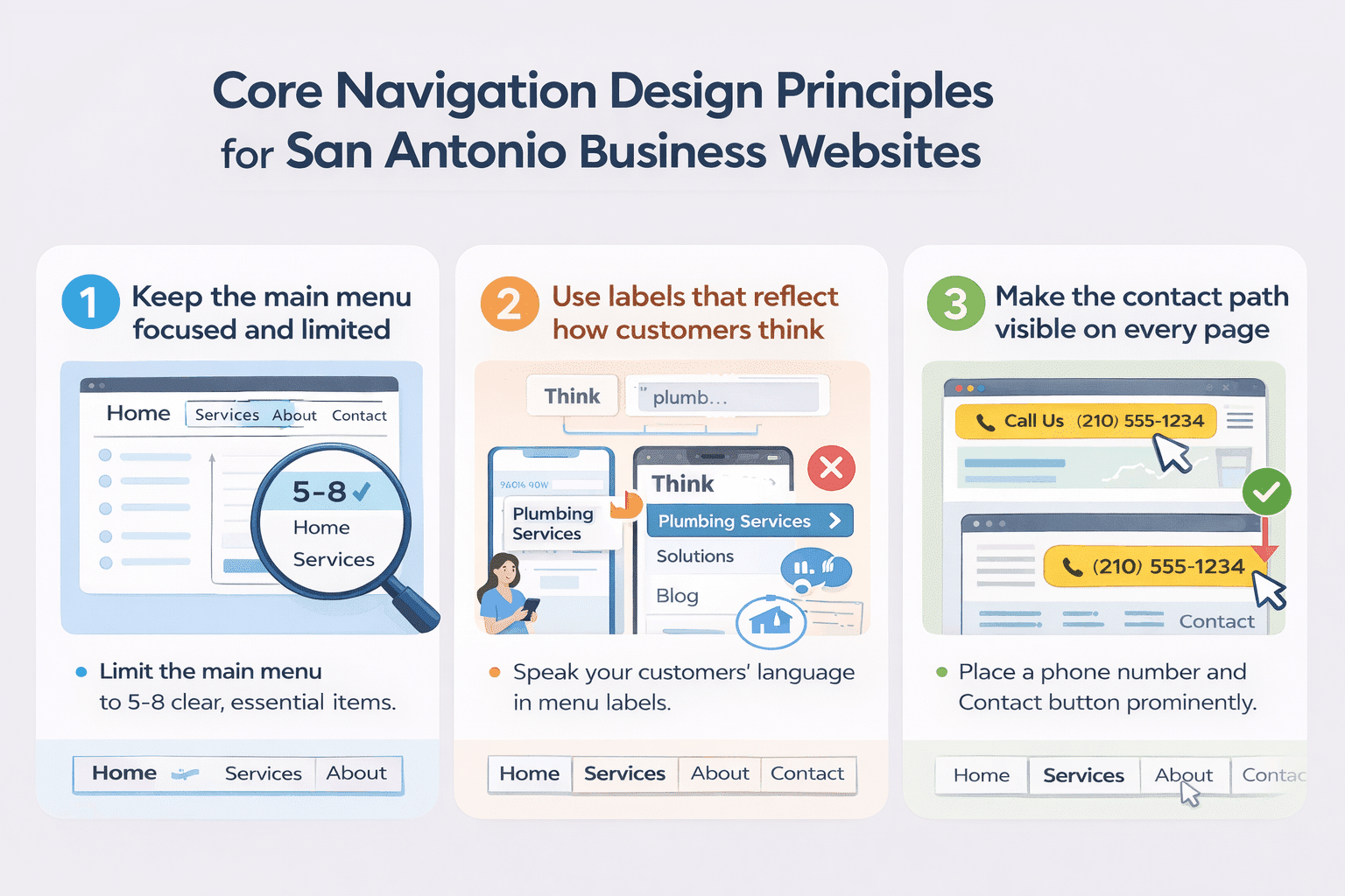 The most common navigation mistake on small business websites is putting too many items in the main menu. Every option added to a menu forces a visitor to make a decision. Too many decisions create hesitation, and hesitation leads to exits.
UX research consistently recommends limiting main navigation to five to eight items. For a San Antonio service business, that typically means: Home, Services (or individual service pages), About, and Contact.
Any secondary pages belong in the footer or a dropdown. Every item in the menu should answer a question a potential customer is actively asking. If it does not serve the visitor, it does not belong in the primary menu.
Use labels that reflect how customers think, not how the business thinks
Menu labels are one of the most overlooked conversion levers on a business website. A plumbing company that labels its menu “Solutions” instead of “Services” is using internal language that creates distance between the visitor and what they are looking for. A law firm that labels a practice area “Litigation Services” instead of “What We Handle” is adding cognitive load where there should be clarity.
Labels should use the words your customers type into Google when they search for you. If your San Antonio web design labels do not match the language of your target customer, the menu feels unfamiliar, and visitors lose confidence in the site before they reach your content.
Make the contact path visible on every page
For most San Antonio service businesses, the goal of the website is to generate a phone call or a form submission. That means the path to contact should never require a visitor to search for it. A phone number in the header, a Contact link in the main navigation, and a call-to-action button above the fold on every key page are the minimum requirements.
Visitors who are ready to call do not want to scroll through a page or click through three levels of navigation to find your number. Every additional step between a visitor’s intent and your contact information reduces the likelihood they follow through. The contact path should be the easiest journey on the entire site.
Mobile Navigation: The Priority, Not the Afterthought
Baymard Institute’s latest benchmark of leading e-commerce sites found that mobile navigation performance trails desktop by nine percentage points, and most mobile sites are already performing poorly. Mobile connections are typically slower, screens are smaller, and thumbs are less precise than mouse cursors. All of this means mobile navigation requires more deliberate design, not less.
A responsive web design approach adapts layout for every screen size, but a responsive layout alone does not solve mobile navigation. A menu that collapses into a hamburger icon needs clear tap targets, enough spacing between items to prevent mis-taps, and a logical order that puts the most important pages first.
Sticky headers, which are navigation bars that remain fixed as a visitor scrolls, significantly improve the mobile experience. Nielsen Norman Group research confirms that sticky headers increase the discoverability of navigation elements and the likelihood that visitors use them. For San Antonio businesses where mobile local searches make up the majority of inbound traffic, this is not optional.
Navigation Structure and SEO: How They Connect
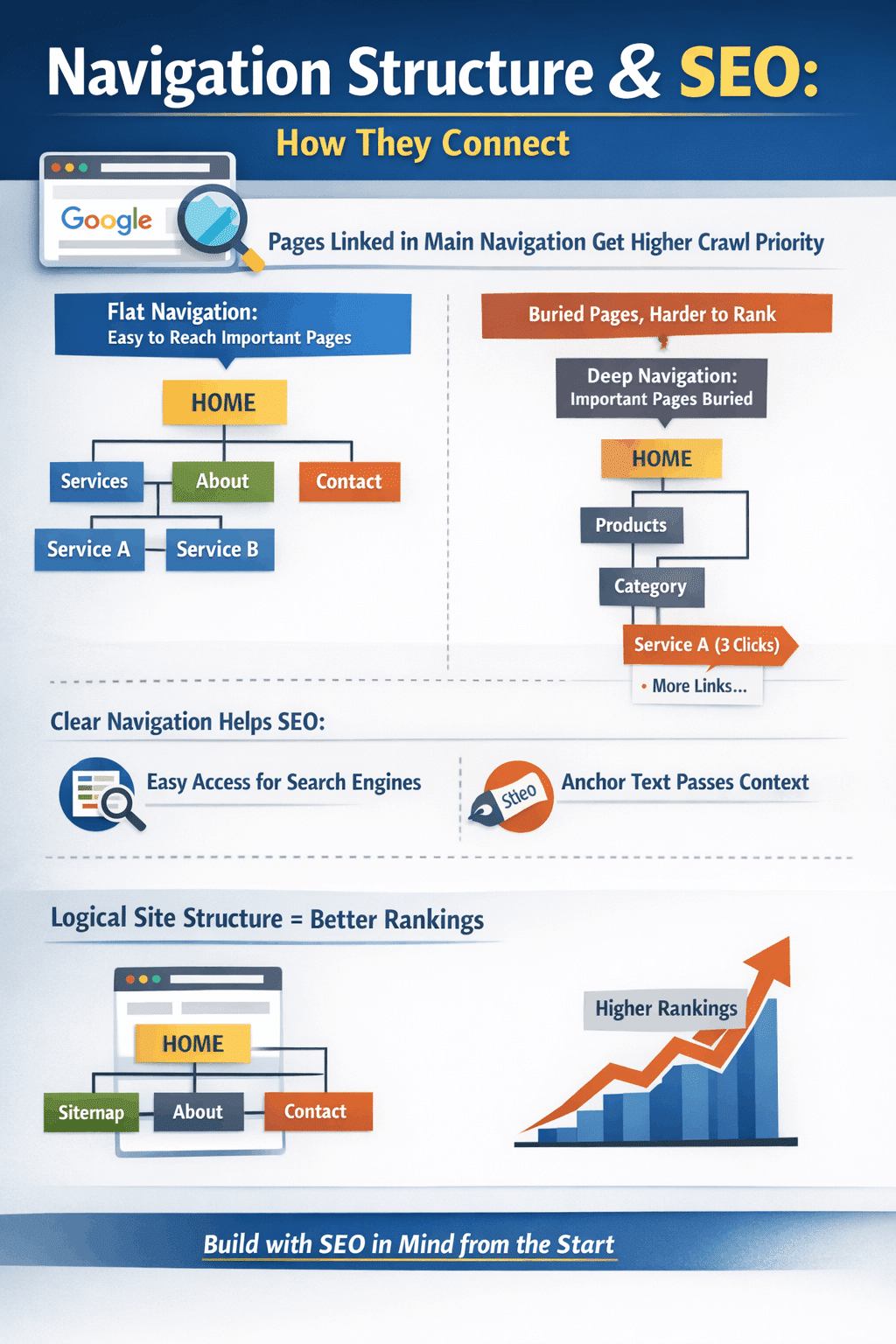 Navigation is not just a user experience element. It directly affects how search engines understand and rank your website. The pages linked in your main navigation receive more crawl priority than pages buried several clicks deep.
If your most important service pages are hard to reach from the homepage, they are also harder for Google to find, index, and rank for San Antonio search terms.
A flat navigation structure, where the most important pages are reachable in one or two clicks from the homepage, distributes ranking power more evenly across the site.
Internal links in the navigation also pass context. The anchor text used in a menu label signals to search engines what that page is about.
This connection between navigation architecture and search performance is why decisions made during the web design process have lasting SEO consequences.
A site built with clear hierarchy, logical URL structure, and keyword-relevant navigation labels will outrank an otherwise equal site that buries its service pages three levels deep.
Common Navigation Mistakes San Antonio Business Websites Make
Most navigation problems on local business websites fall into recognizable patterns.
Dropdown menus with too many levels force visitors to navigate sub-menus and sub-sub-menus to reach the page they want. If a visitor has to hover over three levels to reach a service description, the navigation is too complex for a service business website.
Inconsistent navigation between pages breaks the mental map a visitor builds as they move through the site. If the menu changes structure or disappears on certain pages, visitors lose their sense of where they are and often restart from the homepage or leave entirely.
No active state indicators leave visitors unable to tell which page they are on. A visual signal, such as a color change, underline, or bold weight on the current page label, is a basic orientation cue that many business websites skip. Baymard Institute’s latest benchmark found that 95% of sites fail to highlight the user’s current scope in the main navigation, making it the highest-failure-rate issue in their benchmark.
Footer navigation is often ignored, but functions as a secondary navigation system for visitors who scroll to the bottom without finding what they needed. A well-organized footer with service links, contact information, and location signals gives those visitors a second chance to convert.
Build Navigation That Works for Your Business and Your Customers
Good navigation design is invisible. When it works, visitors move through your site without thinking about the structure. They just find what they need and take action. When it fails, visitors feel the friction even if they cannot name it, and they leave.
For San Antonio businesses, navigation is one of the highest-leverage investments in a website redesign. Fixing a menu structure, clarifying labels, adding a visible phone number to every page header, and simplifying the mobile experience can produce measurable improvements in lead volume without changing a word of content.
Texas Web Design builds websites where navigation is part of the strategy from day one, not an afterthought adjusted after launch. Our full-service digital marketing approach means every decision, from menu structure to mobile behavior, is made with your San Antonio customers in mind. Call 210-985-8528 to see what better navigation could mean for your business.
Frequently Ask Questions
What is website navigation design?
Website navigation design is the process of planning and building the menus, links, labels, and page structure that allow visitors to move through a website and find what they need. It includes the main header menu, mobile navigation, footer links, breadcrumbs, and any internal links that guide visitors between pages. For San Antonio business websites, good navigation design is what turns a visitor into a lead by making the path to contact clear and easy.
How many items should a business website menu have?
Most UX research recommends limiting the main navigation menu to five to eight items. More than eight options forces visitors to process too many choices simultaneously, which creates decision fatigue and increases the likelihood they leave without clicking anything. For a typical San Antonio service business, the main menu should include the homepage, one to three service pages or a services section, an about page, and a contact page.
Why does poor navigation hurt SEO?
Navigation directly affects SEO in two ways. First, Google uses mobile-first indexing, meaning the mobile version of your navigation is what determines your search rankings. Confusing mobile menus hurt both visitors and rankings. Second, the pages linked in your main navigation receive more crawl priority from search engines than pages buried deep in the site structure. Service pages not reachable within one or two clicks from the homepage are harder to rank for San Antonio search terms.
What is mobile-first navigation design?
Mobile-first navigation design means planning the navigation for the smallest screen first, then scaling up to desktop. It prioritizes the five to eight most important pages for thumb-accessible menu items, uses adequate tap target sizes, avoids hover-dependent dropdown menus that do not work on touchscreens, and typically includes a sticky header so navigation remains accessible as visitors scroll. Given that the majority of local searches in San Antonio happen on mobile devices, mobile-first navigation is the right starting point for any business website build.
What is a sticky header and does my website need one?
A sticky header is a navigation bar that remains fixed at the top of the screen as a visitor scrolls down the page. Nielsen Norman Group research confirms that sticky headers increase the discoverability of navigation elements and improve the likelihood that visitors use them. For San Antonio business websites with long service pages or detailed content, a sticky header keeps your phone number and navigation visible at all times, removing one barrier between a visitor’s intent and a contact.
How does navigation affect conversion rates?
Navigation affects conversion rates by determining how easily a visitor can reach the pages and contact options that lead to action. Research from Clutch shows that 49% of customers abandon websites they find confusing to navigate. When visitors cannot find what they need quickly, they leave. When the path to your contact page, service details, or phone number is clear and accessible, more visitors follow it through.
What navigation mistakes are most common on small business websites?
The most common navigation mistakes on small business websites include too many menu items, vague or internal-language labels, no phone number visible in the header, dropdown menus with too many levels, inconsistent navigation between pages, and no indication of which page a visitor is currently on. On mobile, additional common mistakes include tap targets that are too small, menus that are hard to close, and navigation that disappears on certain pages.
How often should a business review and update its website navigation?
Navigation should be reviewed whenever a business adds or removes services, redesigns any significant portion of the site, or notices a rise in bounce rates or a drop in contact form submissions. Beyond those triggers, an annual review of navigation using Google Analytics data, specifically which pages visitors enter, exit, and click through, helps identify structural problems before they compound. Navigation is not set once and forgotten. It should evolve as your business and your customers’ needs change.