Importance of Responsive Design in WordPress: Enhancing User Experience Across Devices
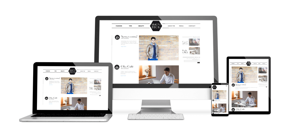
By implementing responsive design principles, WordPress websites can automatically adjust their layout and content presentation, optimizing readability and functionality on devices with varying screen sizes and resolutions.
The importance of responsive design extends beyond mere aesthetics; it directly impacts user engagement and satisfaction, as visitors are more likely to stay and explore a site that provides a user-friendly experience on any device.
At Texas Web Design, our team builds responsive WordPress sites that work flawlessly on every screen. If your WordPress site struggles on mobile or feels outdated, request a free responsive design audit or call 210-985-8528, and we will show you exactly what needs to change.
Get In Touch
Optimizing User Experience: The Vital Role of Responsive Design in WordPress
In today’s tech-savvy environment, where a variety of devices are commonly used, creating a user experience that is both seamless and visually stunning is essential. This is where responsive design comes into play. At Texas Web Design, we understand how game changer a responsive design is for engaging and satisfying users effectively.
Responsive design ensures a seamless and user-friendly experience, automatically adjusting layout and content for optimal viewing on any device. Beyond aesthetics, this functionality enhances navigation and readability and reduces bounce rates, contributing significantly to visitor retention.
The practical benefits include cost and time savings, as a single responsive site eliminates the need for multiple versions for different devices. In an ever-changing digital environment, responsive design in WordPress remains a critical component for competitive performance across all user interfaces.
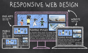
Conceptualizing Responsive Design
The discussion about responsive design focuses on how a website adapts to different devices, ensuring that content is accessible and seamless.
Defining Responsive Design
Responsive design refers to a web development approach where a site’s layout and content are fluid, allowing it to adjust automatically to any device’s screen size and resolution. In
WordPress, themes, and plugins are developed with responsive design principles to make sure that websites remain accessible, usable, and aesthetically consistent across all devices, from desktops to smartphones.
Evolution of Web Design
The trajectory of web design has shifted dramatically with advancements in technology. Initially, websites were built for fixed-width layouts tailored to desktop monitors. However, as the number of mobile devices increased and screen sizes varied, the industry shifted toward responsive design.
This evolution highlights the necessity for WordPress sites to incorporate adaptive layouts, flexible images, and media queries, maintaining an optimal user experience irrespective of how the site is accessed.
The Responsive Design Process
The responsive design process is integral in creating WordPress sites that provide an optimal viewing experience across a variety of devices.
It involves meticulous planning, adaptable layouts, and the strategic use of media queries.
Planning and Strategy
Initially, designers must understand the content hierarchy and user experience objectives. They define key performance indicators (KPIs), which guide the design decisions to align with the overall business objectives.
This stage often involves wireframing and creating a visual guide that represents the skeletal framework of the website.
Fluid Grids and Layouts
Instead of using fixed-width units such as pixels, designers employ relative units like percentages. This approach allows elements to grow or shrink in relation to one another, ensuring consistency across devices.
Media Queries and Breakpoints
Media queries enable the application of different CSS styles based on device characteristics, most commonly screen widths. Breakpoints are defined to trigger these style changes, ensuring that layouts, fonts, and other design elements adapt to the user’s device.
A common practice is to establish breakpoints at widths where the design naturally breaks, thus enhancing the user’s experience.
WordPress Themes and Responsiveness
Choosing Responsive Themes
Selecting the right responsive theme is the first step in providing an excellent user experience. Themes labeled as responsive are designed to automatically adjust their layout to fit the screen sizes of smartphones, tablets, and desktops.
For example, the theme might reposition sidebars or navigation menus, resize images, or change font sizes when viewed on different devices. Users should look for themes that offer:
Fluid layouts: These ensure that the page expands or contracts to match the device’s width.
Flexible images: Images should scale within their containing elements to avoid a broken layout.
Media queries: CSS technology that adapts the presentation to the user’s screen.
It’s important to preview a theme on various devices before finalizing the choice to guarantee it meets the necessary responsive criteria.
Custom Themes versus Pre-built
While pre-built themes offer a quick route to a responsive site, custom themes allow for greater control and specificity in design.
However, creating a custom responsive theme requires considerable design and development expertise, as it involves writing custom media queries and potentially using JavaScript to manage layout changes.
Pre-built themes, on the other hand, are widely available and can be a cost-effective and time-saving choice.
With a vast range of responsive themes to choose from, users can often find one that closely matches their needs without additional coding. These themes come with built-in responsiveness, making them a reliable choice for those without the ability or budget to develop a custom theme.
Top Responsive WordPress Themes in 2026
Choosing a strong responsive theme is the fastest way to make a WordPress site work well across devices. The themes below are widely used in 2026 because they combine clean responsive code, fast load times, and strong compatibility with popular page builders.
Astra: Lightweight and highly customizable. Loads quickly, works with Elementor, Beaver Builder, and Gutenberg, and includes hundreds of pre-built starter sites. A safe default for most business websites.
GeneratePress: Known for its small file size and clean code. Strong choice for sites that prioritize page speed and Core Web Vitals scores.
Kadence: Modern theme with native block editor support and a strong template library. Good for sites built with Gutenberg or Kadence Blocks.
Blocksy: Built specifically for the WordPress block editor. Includes advanced layout controls and integrates well with WooCommerce.
OceanWP: Multipurpose theme with extensive demo content. Strong choice for businesses that want a polished design out of the box.
For most San Antonio businesses, any of these five themes provides a reliable responsive foundation. The right choice depends on the page builder being used and how much customization the site needs.
WordPress Plugins That Support Responsive Design
The right plugins extend what a responsive theme can do. The plugins below are the most commonly used in 2026 for handling mobile-specific behavior, image optimization, and performance.
WP Mobile Menu: Adds a clean, customizable mobile menu to any theme. Useful when the theme’s default mobile menu is hard to navigate.
WPtouch: Creates a separate mobile theme experience for WordPress sites. Best used when a full responsive rebuild is not feasible.
ShortPixel: Compresses images and converts them to WebP automatically. Reduces page weight on mobile dramatically.
WP Rocket: Caching plugin that improves load times across all devices, including mobile.
Smush: Free image compression alternative to ShortPixel for sites on a tighter budget.
A responsive theme paired with these plugins covers most of what a small business WordPress site needs to perform well on mobile.
Responsive Design and WordPress Full Site Editing
WordPress changed significantly with the introduction of Full Site Editing (FSE) and block themes, which are now the default for new WordPress sites in 2026. These changes affect how responsive design works inside WordPress.
What Full Site Editing means for responsive design
Full Site Editing lets users design every part of a WordPress site, including headers, footers, and templates, directly from the block editor. Block themes built for FSE include responsive controls inside each block, which means designers can set different padding, font sizes, and layouts for desktop, tablet, and mobile without writing custom CSS.
Block themes vs classic themes
Classic themes rely on PHP templates and CSS for responsive behavior. Block themes use HTML templates and the WordPress block editor for both design and responsive behavior. Both approaches can produce strong responsive sites, but block themes give non-developers more direct control over how the site looks on each device.
For a San Antonio business choosing between a classic theme like Astra and a block theme like Twenty Twenty-Four, the deciding factor is usually who will be maintaining the site. Block themes are easier for content editors to work with, while classic themes paired with page builders give designers more control over advanced layouts.
User Experience and Mobile Optimization
The case for responsive WordPress design comes down to where users actually are. According to DataReportal’s April 2026 Digital Around the World report, 96.2% of internet users go online using a mobile phone at least some of the time, and mobile devices now account for over 62% of all global web traffic. In the United States, 91% of internet users access the web primarily through mobile devices.
For WordPress sites, these numbers make responsive design a baseline requirement. A WordPress theme that does not adapt to mobile screens loses visitors and search rankings simultaneously.
Increasing Mobile Traffic
With mobile web usage consistently outpacing desktop since 2016, an optimal experience for these users isn’t just recommended; it’s crucial for WordPress sites. The data shows a clear shift favoring mobile devices, which means websites must be designed with a mobile-first mindset to capture this extensive market share.
Ease of Navigation
Responsive design directly impacts how easily users can navigate a site on their devices. Websites that adapt to different screen sizes allow users to find what they need without zooming or horizontal scrolling.
This adaptability is not just a convenience—it’s a key factor in keeping the user engaged and reducing bounce rates.
Loading Speed and Performance
Responsive WordPress sites typically load faster on mobile devices, thanks to optimized images and fluid grid layouts. A site that adjusts its content based on the device ensures that loading times are reduced, which is a significant factor in user engagement and retention, as well as search engine ranking.
Impact on SEO and Visibility
The adoption of responsive design in WordPress is essential for enhancing SEO and increasing the visibility of a website. It directly influences how a website is indexed and ranked by search engines.
Google’s Mobile-First Indexing
In Google’s mobile-first indexing approach, Google predominantly uses the mobile version of the content for indexing and ranking. The importance of responsive design in WordPress is underscored by this shift, as it ensures a site’s compatibility with mobile devices, which is a crucial factor for Google’s crawlers.
Improved Search Rankings
A WordPress site with a responsive design often experiences improved search rankings. This is because search engines favor websites that provide a strong user experience across all devices. Responsive WordPress sites also tend to score better on Google’s Core Web Vitals metrics, which are confirmed ranking factors.
Analysis and Testing
Ensuring that a WordPress website is fully responsive is crucial for user engagement and SEO performance. This section focuses on the methods and tools one can use for analyzing and testing the responsiveness of a WordPress site.
Tools for Testing Responsiveness
Several tools are available to help web developers test the responsiveness of their WordPress websites:
Online Emulators: Services like MobileTest.me and Responsinator allow webmasters to check how a website looks on different devices without needing the actual devices in hand.
Browser Developer Tools: Built-in tools in browsers like Chrome, Microsoft Edge, and Firefox offer ‘Device Mode’ to simulate mobile devices.
Google’s Mobile-Friendly Test: This tool gives insights into how well a website performs on mobile devices and is considered in Google’s search rankings.
Interpreting Data and Metrics
Once data is collected using the aforementioned tools, interpreting it correctly is key to implementing effective responsive design:
Layout Breakpoints: Analyze how content adjusts at various screen sizes to determine if layout breakpoints are functioning as intended.
Loading Times: Assess if there is a significant increase in loading times at smaller screen sizes due to non-optimized images or scripts.
Usability: Ensure buttons, links, and navigation menus are easily usable across devices, considering touch screen functionality and readability.
Best Practices for Responsive WordPress Design
These best practices focus on maintaining design integrity and providing seamless user interaction.
Image and Multimedia Management
Managing images and multimedia effectively is critical for responsive design. Proper image optimization is critical for quick loading without compromising quality
This includes using appropriate file formats, such as JPEG for photographs and PNG for graphics with transparency.
Additionally, utilizing WordPress’s built-in functions like add_image_size can create various image sizes for different screen resolutions, while CSS techniques like background-size: cover can control how background images scale on the page.
Typography and Readability
Typography plays a significant role in the readability of a site. Responsive design should incorporate flexible text sizes and line heights that adapt to the user’s device. CSS units like REMs or percentages adjust text relative to the screen size, aiding in scalability.
Optimal line length (around 50-75 characters) is crucial for comfortable reading on all devices. One must also consider the font family; it should be legible across different operating systems and devices.
Accessibility Considerations
WordPress sites must be accessible to all users, including those with disabilities. Color contrast should meet AA or AAA WCAG standards to ensure text stands out against background elements for those with visual impairments.
Moreover, implementing keyboard navigation and screen reader compatibility is vital. Sites should use semantic HTML5 elements like <nav>,<main>, <aside>, and <footer> to define content structure clearly and include descriptive alttags for all images.
Elevate Your Texas Web Design with Responsive Excellence in WordPress
The significance of responsive design in WordPress cannot be overstated, especially given the dynamic landscape of web design. With users accessing websites on various devices, ensuring a seamless and visually appealing experience across screens is not just a trend but a necessity.
Responsive design not only enhances user satisfaction but also positively impacts search engine rankings, making it a crucial element for success in the ever-evolving digital landscape.
Embracing responsive design in your WordPress site is not just a choice; it’s a strategic decision that caters to the diverse needs of your audience, promoting a user-centric and future-proof online presence.
It ensures that websites look good and function properly on all devices. This consistency in user experience can lead to increased user satisfaction and can help boost search engine rankings.
To provide a seamless and consistent experience to users across all devices, ensuring easy navigation and readability without the need for manual adjustments or zooming.
Improved user engagement, higher traffic, and higher search engine rankings. It also provides the flexibility to cater to users on both desktops and mobile devices.
It enhances user experience by making the site accessible and functional across diverse devices and screen sizes, which can lead to longer visit durations and reduced bounce rates.
The fastest way is to switch to a responsive WordPress theme like Astra, GeneratePress, Kadence, or Blocksy. All modern WordPress themes built in the past few years are responsive by default. After switching themes, test the site across phones, tablets, and desktops using browser developer tools or PageSpeed Insights, then adjust spacing, font sizes, and image sizes as needed for each breakpoint.
There is no single best theme because the right choice depends on the site. For most small business websites, Astra and GeneratePress are reliable defaults. For sites built with the WordPress block editor, Kadence and Blocksy are strong picks. For multipurpose business sites that need polished designs out of the box, OceanWP is a popular choice. All of these themes are responsive, fast, and well-maintained.
Yes. All block themes built for WordPress Full Site Editing include responsive controls inside the block editor itself. This means designers can set different layouts, font sizes, and spacing for desktop, tablet, and mobile without writing custom code. Block themes generally produce cleaner, more consistent responsive behavior than older classic themes that rely on custom media queries.
TESTIMONIALS
“
Love their attention to detail, very quick to respond to my marketing edits that were needed ..Would highly recommend for all your marketing needs!
Crystal M.
“
These guys are awesome!!! The best customer service and the best SEO Company in the San Antonio, Tx area!!
Jason Rozacky
“
Not only do their services work, but they are also a pleasure to work with. They are super responsive and go above and beyond to exceed expectations. Highly recommend!
Joshua P
“
Their service goes above and beyond and definitely exceeds expectations. They are professionals and I look forward to many long successful years with them as their client.
Walter Wilson
Our mission is to provide attainable marketing solutions and deliver the finest customer experience with proven results.

 The responsive design process is integral in creating WordPress sites that provide an optimal viewing experience across a variety of devices.
  These best practices focus on maintaining design integrity and providing seamless user interaction.