
 Typography plays a major role in how people read, understand, and interact with content. It shapes the way users process information and influences how trustworthy a website feels.
At Texas Web Design, we focus on making typography clear, consistent, and practical. Every decision about font, spacing, and alignment has an effect. Typography can make content feel easy to read or frustrating to get through. When it’s done right, users find what they need faster, stay engaged longer, and feel more confident about the brand they’re interacting with.
If you’re building or refreshing your website and want better results through smart design, contact us today. We’ll help you make typography work harder for your business.
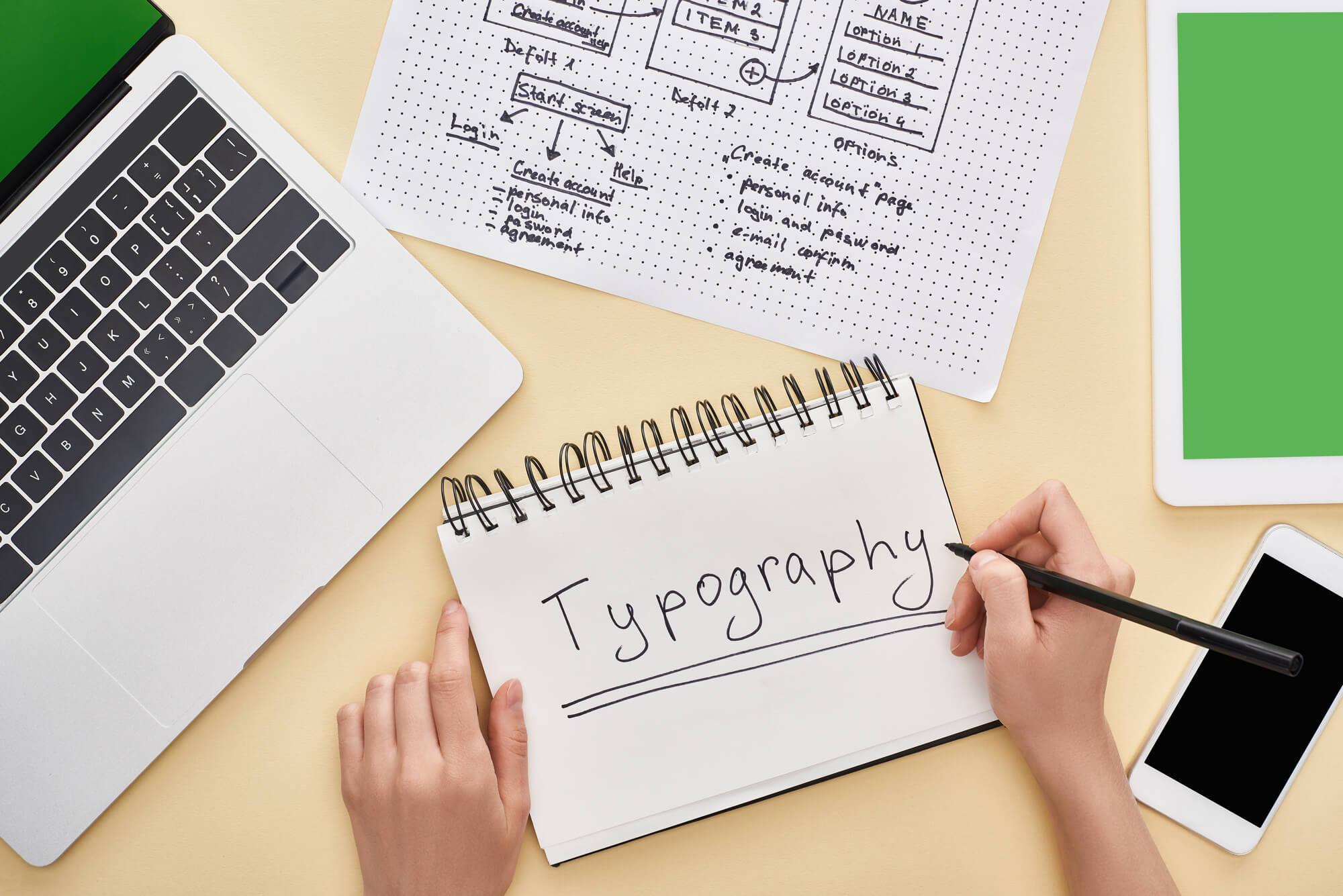
What Is Typography?
Typography is the visual arrangement of text. It includes font selection, size, spacing, line height, alignment, and weight. These elements work together to guide how people read and respond to content.
Nearly 90% of online content is text. When visitors land on your site, they scan headlines, read product descriptions, and click calls-to-action — all driven by typography.
It’s not just about visual appeal. Good typography improves accessibility, sets the tone for your content, and adds visual order. When typography is hard to follow or cluttered, people may feel disconnected or overwhelmed. That disconnection causes them to leave, often without fully engaging.
How Typography Affects User Experience
Typography impacts how users feel, what they notice, and how easily they interact with your content.
Here are the core ways it influences behavior and outcomes:
-
It Improves Readability and Comfort
 When content is difficult to read, people won’t stay—even if the information is valuable. Fonts like Arial, Helvetica, and Open Sans are simple, clean, and often easier to read across devices. These sans-serif fonts are common choices for web interfaces because they reduce visual strain.
Spacing is just as important. Adding white space around your content—especially about 20% on each side of a paragraph—helps guide the eye and improve focus. Generous line height makes blocks of text feel open, especially on mobile screens.
Color contrast is another factor. A text-to-background contrast ratio of 4.5:1 or higher helps users with visual limitations read comfortably, reducing friction while moving through the page.
All of these adjustments help people process your content naturally. It keeps them focused, encourages interaction, and supports longer engagement.
-
It Organizes Content with Clear Structure
Most users don’t read everything. They scan. Typography provides structure to help them find what matters. Bold headlines, organized subheadings, and visible paragraph breaks all lead users through your content.
These elements show readers what to focus on — without overwhelming them. For example, when a bold CTA stands out from body copy, it’s easier to find and more likely to get clicked. When product names are styled to catch the eye, users don’t have to search.
Typography helps organize the experience. It creates a rhythm that moves users through the page without confusion.
-
It Makes Navigation Easier
Typography plays a quiet but important role in how people move through your site. Menus, labels, and links — they all rely on typography to be clear and easy to spot. If your navigation text looks like your body content, users might miss it. But if it’s bold, spaced well, or styled differently, users can scan and act without second-guessing themselves.
A strong typographic system helps people move from one section to the next quickly. They don’t have to think about where to click or how to get back. That smooth experience leads to higher interaction and better results.
-
It Reinforces Your Brand Style
Typography is one of the clearest ways to express brand personality. Whether your business is formal, creative, bold, or playful — the right font styles will reflect that.
Tech companies often use clean, modern fonts to suggest simplicity and innovation. Creative agencies might go for more expressive fonts with unique styling. What matters most is consistency. Using the same typography across your site, ads, emails, and visuals creates a recognizable identity.
Over time, users begin to associate those fonts with your business. That consistency makes your brand feel reliable and familiar.
-
It Sets the Tone for the Content
Typography affects the mood of your message before users even start reading. Rounded fonts feel soft and casual. Thin, structured fonts come off as modern or upscale. Larger fonts command attention. Small fonts can feel subtle or quiet.
These decisions set expectations. They guide how users perceive the content — whether it’s energetic, informative, laid back, or high-end. When the typography tone matches the message, the experience feels natural and connected.
 When content is difficult to read, people won’t stay—even if the information is valuable. Fonts like Arial, Helvetica, and Open Sans are simple, clean, and often easier to read across devices. These sans-serif fonts are common choices for web interfaces because they reduce visual strain.
Why Typography Matters for Business
Typography helps people get the information they’re looking for without confusion. Every part of your content—from headlines to disclaimers—relies on how the text is styled.
 Here’s what strong typography can do for your business:
- Improves Readability: Make content easier to read so users can absorb your message without effort.
- Clarifies Content Priorities: Helps users understand what’s most important through clear hierarchy and layout.
- Encourages Faster Decisions: Support quicker decision-making by guiding attention to key actions or information.
- Strengthens Brand Image: Build brand consistency and trust by using a uniform, recognizable text style across all platforms.
If your typography is hard to follow or feels inconsistent, users may leave before they even give your message a chance.
Small Adjustments That Improve the Experience
You don’t need to completely rebuild your website to improve typography. Simple updates can make your content easier to read and more enjoyable to engage with.
Try these typography improvements:
- Choose Readable Fonts: Use clean fonts that reflect your brand’s personality without distracting the reader.
- Improve Line and Paragraph Spacing: Leave space between lines and paragraphs to make content feel more open and comfortable.
- Break Up Content with Subheadings: Use subheadings to divide long blocks of text and help readers scan quickly.
- Stay Consistent with Alignment: Stick to consistent text alignment throughout the page to maintain a clean layout.
- Make CTAs Stand Out: Style your calls to action with size and font weight to draw attention at the right time.
- Keep Fonts Uniform Across the Site: Use consistent font styles on every page to strengthen your brand and create a cohesive experience.
These changes help guide users through your site more easily. They also make your content feel more polished and aligned with your brand.
Let Typography Work for You
Typography influences everything from readability to engagement. It shapes how users feel about your brand, how they process your content, and how confident they are when taking the next step.
If your website feels disjointed or hard to follow, typography could be the issue. The good news is that small changes can make a big difference — and those changes don’t need to be complex.
At Texas Web Design, we help businesses improve user experience through smart, readable, brand-aligned typography. Call us today if you’re refreshing your current site or starting from scratch. Let’s build something better—one word at a time.