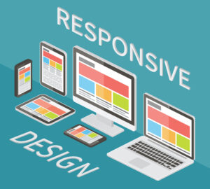
Responsive web design is a web development approach that automatically adapts a website’s layout, images, and content to fit any screen size, improving usability, accessibility, and search engine rankings.
Ever wondered why some websites look flawless on any device? The answer lies in responsive web design, a key component in today’s digital world where users switch between phones, tablets, and desktops. Ensuring your website adapts to these different screens is important for delivering a smooth and enjoyable browsing experience.
In this post, we’ll explore the fundamentals of responsive web design and how it can enhance your site’s usability and appeal. At Texas Web Design, we’re ready to help you create a site that shines on every device.
Contact us now for more information!
What is Responsive Design?
 Responsive web design ensures web content adapts to various screen sizes and devices. This approach makes websites look great on desktops, tablets, and smartphones alike.
By using responsive layouts, developers create a single version of a website that automatically adjusts based on the device’s screen size.
This eliminates the need for multiple versions of the same site. Users get a seamless experience, whether they’re browsing on a laptop or scrolling through their phone.
User Experience
A key benefit of responsive design is the enhanced user experience. Content becomes easily readable and navigable, regardless of the device used.
Responsive websites prioritize user needs, making interactions simple and intuitive. This responsiveness boosts satisfaction and keeps visitors engaged longer. It reduces frustration caused by zooming and shrinking text or images to fit smaller screens.
SEO & Accessibility
Making websites mobile-friendly improves accessibility and SEO. Google prioritizes responsive design in its ranking algorithms because it provides a better user experience.
Responsive web designs also meet accessibility standards, ensuring everyone, including people with disabilities, can access information easily. This inclusivity broadens your audience reach and enhances your site’s visibility in search results.
-
Fluid Grid System
Fluid grids are key to responsive design. They use relative units like percentages, not fixed ones like pixels. This makes web pages adapt smoothly to any screen size.
Grids ensure elements resize in relation to each other. This keeps the layout consistent across devices. It’s about maintaining harmony as the user switches from a laptop to a mobile phone.
Seamless Transitions
Making layouts shift without hiccups between devices is crucial. Fluid grids are designed for this purpose. They allow content to flow freely, fitting the available space.
This approach prevents awkward gaps or overlaps. Users get a smooth experience, no matter their device’s width. It’s all about fluidity and adaptability in design.
Adaptability
The goal is simple: make websites look good on any screen. Fluid grids play a big part in achieving this. By using percentages, the grid adjusts based on screen size.
Elements grow or shrink but keep their proportions. This adaptability is what sets responsive design apart. It ensures that no matter where your site is viewed, it looks its best.
-
Fluid Images
Image Scaling
Images must scale seamlessly to fit their containers. This ensures that as the layout shifts, the images adjust without losing their aspect ratio or becoming distorted. It’s crucial in maintaining a site’s visual integrity across different devices.
To achieve this, developers set images to max width: 100%. This simple CSS rule makes sure that images never exceed the width of their container, allowing them to shrink or grow depending on the screen size.
Responsive Techniques
It’s a technique that complements fluid grids well, ensuring that both the structure and content of a website reflow smoothly as the viewport changes. By specifying multiple sources for an image, developers can control how it appears on various screens, from smartphones to desktop monitors.
Scalable Graphics
SVGs are ideal for icons and graphics. Unlike traditional bitmap images, SVGs scale without any loss of quality. They’re perfect for logos, icons, and other visuals that need to remain crisp at any size.
This vector format is lightweight and code-based, meaning it can be easily styled with CSS and integrated into responsive design systems. SVGs ensure that graphical elements remain sharp and clear, enhancing the overall aesthetics of a responsive website.
-
Media Queries

Developers often set breakpoints in the code. These breakpoints signal when the website’s layout should adjust to accommodate a new screen size.
The common practice is to start with a mobile-first approach. This means designing for the smallest screens first and then adding queries to scale up for larger screens.
Mobile-First
Adopting a mobile-first strategy ensures websites are optimized for the vast number of users on mobile devices. With more people using their phones for web browsing, prioritizing mobile viewing experiences is crucial.
This approach not only improves usability for mobile device users but also boosts SEO performance. Search engines favor mobile-friendly sites, especially since mobile searches have surpassed desktop ones in volume.
Conditional CSS
Media queries allow for conditional application of CSS rules. This flexibility means a website can present its best version regardless of whether it’s being viewed on a phone, tablet, or desktop monitor.
Best Practices and Considerations
Mobile First
Prioritizing content and functionality for mobile users is crucial. This approach ensures the website’s design adapts to smaller screens before scaling up. It’s a flexible method that enhances user experience from the start.
Designers must focus on essential features and text readability on mobile devices. This simplicity benefits all users, regardless of their device.
Testing Consistency
Testing across multiple devices and screen resolutions is vital. It ensures the designs remain consistent and functional everywhere.
This practice identifies layout issues early. Fixing these problems improves the overall experience for every visitor.
Collaborative Design
Working closely with UX designers is key to defining effective breakpoints and design patterns. This collaboration results in responsive designs that meet user needs at every size.
Breakpoints should not only respond to device sizes but also to user behaviors. This tailored approach leads to better engagement and satisfaction.
Final Thoughts
Responsive web design is no longer just a nice-to-have—it’s essential for any business looking to thrive online. Mastering the badelivers a seamless experience, regardless of the device. These elements help create an engaging, user-friendly digital space that adapts to your visitors’ needs.
But you don’t have to tackle it alone. At Texas Web Design, we specialize in creating responsive websites that help businesses grow and succeed online. Whether you’re starting from scratch or looking to enhance your current site, our team is here to help you stay ahead in the fast-moving digital landscape.
Keep in touch with us today and let’s build a website that works for you on every screen!
sics—fluid grid systems, fluid images, and media queries—ensures your website


